Object Lab
June 1-4, 2014
C H I P S T O N E
| Search |
Notes:
• Masthead with catagories and search and link buttons remain stationary.
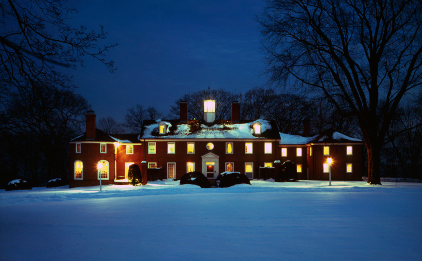
Photo scales.
• Photo area is one large space.
I’ll make the image up and into one jpg file if I want to have more photos
and place it as a single one. .
and place it as a single one. .
• The text block white space on the right I would like to be able to make
it as big as the text would need. I’m sure it will end up being different
amounts of text and different links. Might be nice to be able to move this
around but is OK where it is if necessary or for now. Hope I don’t get sick
of white.
it as big as the text would need. I’m sure it will end up being different
amounts of text and different links. Might be nice to be able to move this
around but is OK where it is if necessary or for now. Hope I don’t get sick
of white.
• Will I be able to move the search and social media buttons around
depending on the image?
depending on the image?