• Figure 1
    Figure 1

    Cupboard, Hadley, Massachusetts, ca. 1715. Oak, maple, chestnut, and yellow pine. H. 61 1/8", W. 50", D. 21 1/4". (From the Collections of The Henry Ford Museum.) 

  • Figure 2
    Figure 2

    Photograph taken in the early twentieth century showing the WA and SH chests in a bedroom at Memorial Hall, Deerfield, Massachusetts, ca. 1910. (Courtesy, Memorial Hall, Pocumtuck Valley Memorial Association.)

  • Figure 3
    Figure 3

    Hadley chest illustrated and discussed in Antiques 10, no. 3 (September 1926): 189–90 (Courtesy, Antiques.)

  • Figure 4
    Figure 4

    Preconservation view of the cupboard illustrated in fig. 1.

  • Figure 5
    Figure 5

    Cross-section sample taken from a red-painted design on a drawer front of the Hannah Barnard cupboard at 200X in reflected ultraviolet light. This sample was taken before conservation in 1991. 

  • Figure 6
    Figure 6

    Trial cleaning on a drawer front with sample locations noted to assess the level of varnish and overpaint removal.

  • Figure 7
    Figure 7

    Cleaning the upper case of the Hannah Barnard cupboard using isopropanol gel and swabs.

  • Figure 8
    Figure 8

    Detail of the left panel during conservation of the cupboard illustrated in fig. 1.

  • Figure 9
    Figure 9

    35mm photograph of a cross-section sample taken from a degraded blue-green design on a drawer front of the Hannah Barnard cupboard at 500X in reflected visible light. This sample shows a coarsely ground layer of blue verditer pigment in a resinous binder on top of the white background paint. This sample was taken from a cleaning test area in a blackish design area of the compass-drawn decoration on a drawer front. Remnants of the varnish layer above the pebbly blue paint reveal that some of the earliest film finish was left intact in the cleaning process.

  • Figure 10
    Figure 10

    Digital photographs of a cross-section sample (HB-1) taken from a red-orange design behind the right column of the Hannah Barnard cupboard at 200X in reflected visible light (left), reflected ultraviolet light (middle), and with the flurochrome stain DCF to tag saturated and unsaturated lipids (right). This sample was taken in 2008 from a site intentionally left uncleaned during conservation in 1991.

  • Figure 11
    Figure 11

    SEM-EDS analysis of the sample illustrated in fig. 10. These images show the distribution of elements in the white background and red-orange decoration. Vermilion in the red-orange layer is confirmed by the presence of mercury which appears as green in the elemental map. (Photo, Catherine Matsen.)

  • Figure 12
    Figure 12

    Chest, Hadley, Massachusetts, ca. 1715. Red oak, white oak, and chestnut with pine. H. 42 1/4", W. 43 1/2", D. 20 1/2". (Courtesy, Winterthur Museum.)

  • Figure 13
    Figure 13

    35mm photograph of a cross-section sample taken from a deep red area of a compass-generated motif on a drawer front of the chest illustrated in fig. 12 at 250X in reflected ultraviolet light. Two layers of finely ground overpaint are visible on top of a cracked, degraded plant resin varnish and a damaged red paint layer on the white background paint. This sample was taken in 1991.

  • Figure 14
    Figure 14

    Digital photographs of a cross-section sample (W-1) taken from a red-orange area of a compass-generated motif on a drawer front of the chest illustrated in fig. 12 at 250X in reflected visible light (left) and reflected ultraviolet light (right). A coarsely ground blue-gray paint sits directly on top of the original plant resin varnish, which is thin and degraded. The varnish covers the red-orange paint and white background paint beneath it. This sample was taken in 2008.

  • Figure 15
    Figure 15

    SEM-EDS analysis of the sample illustrated in fig. 14. These images show the distribution of elements in the layers. Vermilion in the red-orange layer is confirmed by the presence of mercury which appears as green in the elemental map. (Photo, Catherine Matsen.)

  • Figure 16
    Figure 16

    Digital photographs of a cross-section sample (W-3) taken from the painted vine on the left front stile of the chest of drawers illustrated in fig. 12 at 200X in reflected visible light (left) and reflected ultraviolet light (right).

  • Figure 17
    Figure 17

    SEM-EDS analysis of the sample illustrated in fig. 16. These images show the distribution of elements in the layers. Blue verditer is confirmed by the presence of copper which appears as blue-green in the elemental map. (Photo, Catherine Matsen.)

  • Figure 18
    Figure 18

    Chest, Hadley, Massachusetts, ca. 1715. Oak and pine. H. 43 1/4", W. 45", D. 19 1/2". (Courtesy, Memorial Hall, Pocumtuck Valley Memorial Association; photo, Amanda Merullo.)

  • Figure 19
    Figure 19

    Digital photographs of a sample (SW-1) taken from a repainted blue area of a compass-generated motif on the right front panel of the chest illustrated in fig. 18 at 400X in reflected visible light (left) and reflected ultraviolet light (right). The cross section shows that this area was originally red-orange on a white base coat and that it was repainted after the red-orange layer had become worn and cracked.

  • Figure 20
    Figure 20

    SEM-EDS analysis of the sample illustrated in fig. 19. These images show the distribution of elements in the layers. Vermilion in the red-orange layer is confirmed by the presence of mercury which appears as green in the elemental map image. (Photo, Catherine Matsen.)

  • Figure 21
    Figure 21

    Digital photographs of a sample (SW-6) taken from a repainted triangular design on the worn area of the left front foot of the chest illustrated in fig. 18 at 200X in reflected visible light (left) and reflected ultraviolet light (right).

  • Figure 22
    Figure 22

    Chest, Hadley or Hatfield, Massachusetts, 1695–1715. Oak and yellow pine. H. 33 3/4", W. 47 1/4", D. 20 3/4". (Courtesy, Memorial Hall, Pocumtuck Valley Memorial Association; photo, Amanda Merullo.)

  • Figure 23
    Figure 23

    Digital photographs of a sample taken from the upper left corner of the left panel of the chest illustrated in fig. 22 at 400X in reflected visible light (left) and reflected ultraviolet light (right). This sample shows that the chest initially received a very thin coat of red-pigmented paint. The uneven layer of degraded plant resin varnish directly above the paint is early and probably original. The white haze on the surface is accumulated paste wax.

Susan L. Buck
Early Polychrome Chests from Hadley, Massachusetts: A Technical Investigation of their Paint and Finish

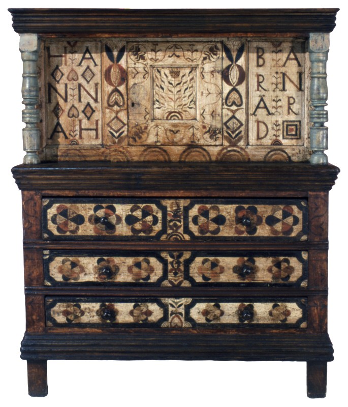
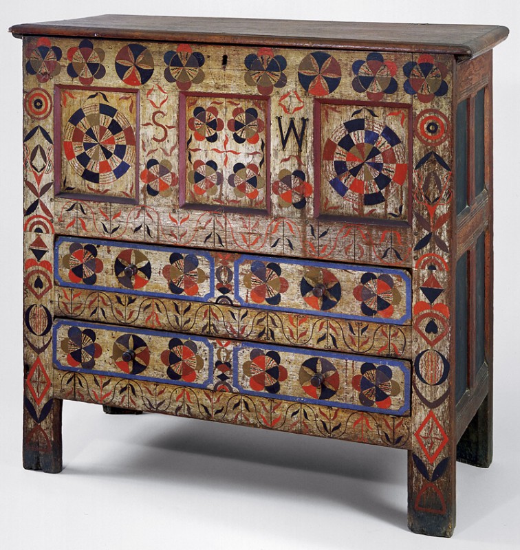
Once in a while newly discovered artifacts or innovative interpretations of previously known objects change our perceptions of how people lived centuries ago. The Hannah Barnard court cupboard from Hadley, Massachusetts, serves as a case in point (fig. 1). Although long recognized as an important example of early-eighteenth-century New England case furniture, the Hannah Barnard cupboard has more recently been viewed as the product “of an isolated craft and patronage system” and as a dower object that says as much about gender roles and the expression of female identity in the Connecticut River valley as it does about regional stylistic preferences. To develop these new interpretations, scholars like Philip Zea, Suzanne Flynt, and Laurel Thatcher Ulrich adopted methodologies drawn from art history, traditional history, social history, and women’s studies. They also incorporated information brought to light through paint and finish microscopy, analysis, and treatment, which is the subject of this article.[1]

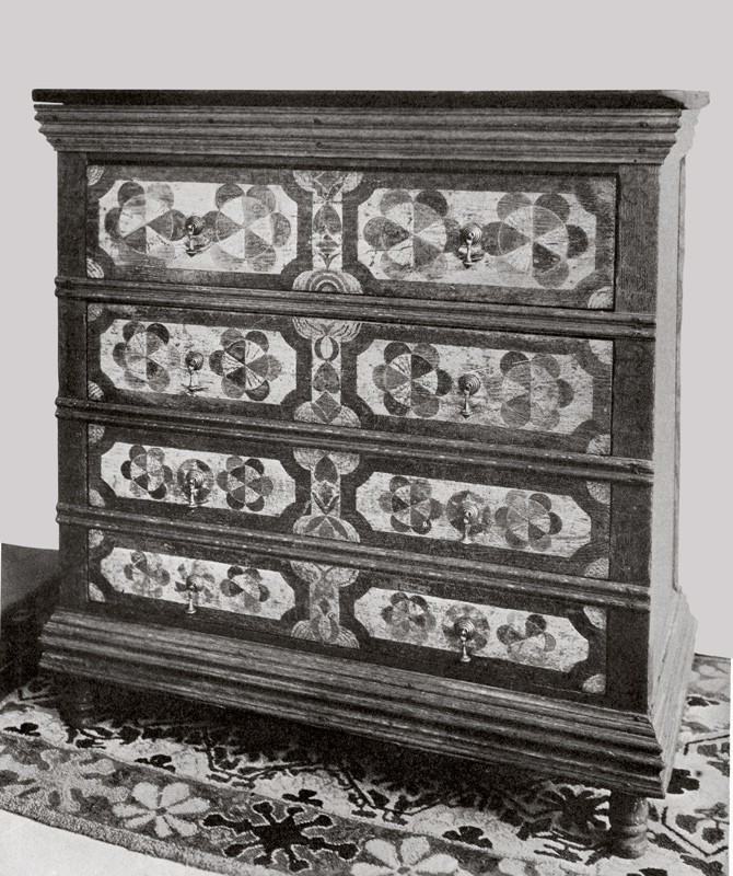
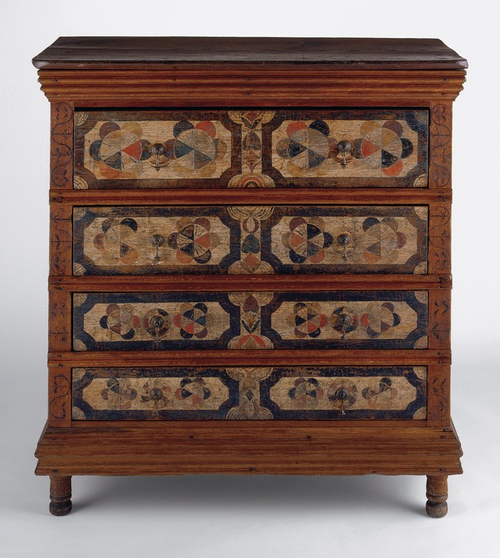
The Hannah Barnard cupboard is an exception among contemporaneous joined case pieces from western Massachusetts, which typically have two-dimensional carved decoration and framing members painted in dark red and black and rarely bear the full name of their original owner (fig. 2). Such an elaborate piece of furniture, emphatically marked with Hannah Barnard’s name, made a clear statement of her significance in her home. Despite having a murky surface and a nearly illegible inscription, the Hannah Barnard cupboard was recognized as an important object when Henry Ford purchased it from antique dealer Israel Sack in 1936. By that date, two Hadley chests with similar painted designs were already in notable collections. George Sheldon, curator of the Pocumtuck Valley Memorial Association in Deer­field, Massachusetts, acquired a two-drawer chest bearing the initials “SW” in about 1870 (fig. 18) and donated it to Memorial Hall a few years later. When Henry Francis du Pont established the Winterthur Museum, his collection included a related chest he had acquired in 1926. The restoration of that chest (fig. 3) was the subject of an article in Antiques published in September of that year. 

The chest of drawers pictured in this month’s Frontispiece stood for some years . . . in a slaughtering barn in Chester, Vermont. That it might make claim to antiquity was obvious; but it was a cumbersome thing, whose somewhat dour massiveness was not materially ameliorated by an enshrouding layer of heavy green paint. . . . none viewed it with comprehending affection until Mark LaFontaine of Springfield, Vermont happened along. Perceiving its ancient flflvor and the stout integrity of its construction beneath its green overlay, Mr. LaFontaine purchased the piece and carried it home, where by the grace of special providence, he personally undertook the task of reconditioning his find. Instinctively he felt that some pattern might be concealed beneath the modern coat of paint. Accordingly, he proceeded slowly, and most carefully, with the aid of paint solvents, until, having removed the last vestige of green paint, he was able to reveal in its entirety one of the most interesting polychrome decorations which has come to light on any American furniture of the period.

The results of this paint removal will be discussed in more detail below, but even a cursory examination of the chest shows LaFontaine’s paint removal efforts wore and abraded the paints on the drawer fronts, and there is still an uneven, grayish green film on the original decoration.[2]

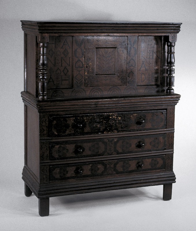
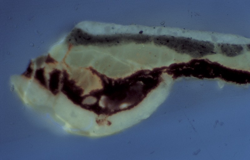
When, in 1991, curators Philip Zea of Historic Deerfield and Suzanne Flynt of the Memorial Hall Museum were planning their exhibition of Hadley chests, the Hannah Barnard court cupboard had a dark brown surface, its compass-generated, inscribed decoration was partially obscured, and no traces of the bright colors and delicate, whimsical, wavy patterns found on the two other chests were visible (fig. 4). The proposed exhibit spurred Michael Ettema of the Henry Ford Museum to allow me to examine the Hannah Barnard cupboard and remove tiny samples from protected, accessible areas of all representative painted surfaces.[3]

To characterize variations in the painted surfaces, I embedded the samples in polyester resin, ground each sample at a right angle to the surface plane to expose the stratigraphy, and examined the cross sections with a fluorescence microscope. Using biological fluorochrome stains, I was able to characterize the organic binder components in the paints and varnish layers. This investigation and subsequent research into the paints on the other two chests revealed that the brown surfaces of the Hannah Barnard cupboard concealed the same type of exuberant polychrome designs. Moreover, the results of the cross-sectional analysis suggested it would be possible to safely and responsibly remove the substantial accumulation of later plant resin varnishes, shellac, layers of overpaint, oily maintenance dressings, and grime to reveal the original oil-bound painted decorations.[4]

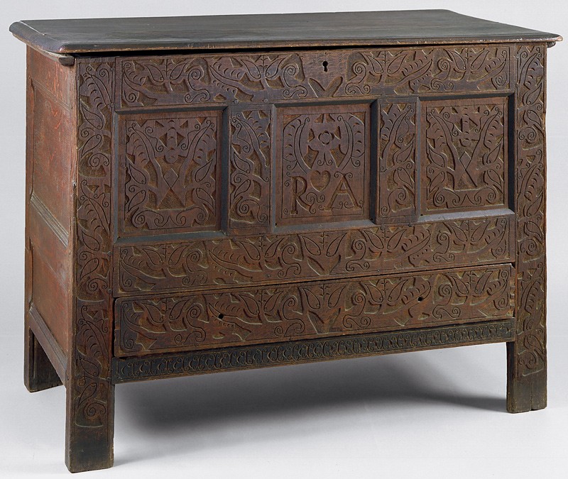
Last year, I revisited the research conducted during the early 1990s using the latest methods and equipment. Access to a new-generation fluorescence microscope with digital imaging, more choices of ultraviolet light filters, and other features allowed me to examine the original samples with greater clarity, cross-check previous characterization of the stratigraphy, and select the most informative samples for further analysis. Winterthur scientist Catherine Matsen performed scanning electron microscopy energy-dispersive spectroscopy (SEM-EDS) to help me identify the specific inorganic components in each layer and more accurately assess the composition and dispersion of the pigments. The 1991 and 2008 investigations provide insights into the relations between the paints used on this group of objects, as well as more information about how the brilliant colors of the original decoration have irrevocably changed over time. This new research also facilitates comparisons between the paints used on the Hannah Barnard cupboard and related chests, as well as those on a carved Hadley chest with a two-color scheme and the initials “RA” (fig. 22).[5]

The Painted Surfaces of the Hannah Barnard Court Cupboard
At the time of the 1991 investigation, the Hannah Barnard cupboard had been languishing in storage at the Henry Ford Museum for many years. Its nearly monochromatic dark brown surface (fig. 4) resulted from an annual rubdown with a linseed oil, turpentine, and vinegar dressing, a detrimental practice followed by many museums and collectors of Ford and du Pont’s era. A large container of this concoction still remained in the Ford Museum’s conservation lab in 1991, complete with a long brown drip of polymerized oil hanging from its spout as a warning of what could happen if it was applied to any more objects.[6]

The first phase of the initial investigation involved sampling and analyzing all the various design components on the front of the cupboard as well as the sides and top, to determine the comparative coating stratigraphies. The paint and varnish history on the cupboard was described in several reports.

The cross-sections showed that the drawer fronts and upper panels were first painted with a white paint layer, and then the intricate floral and geometric patterns were formed of green, bright red, blue, maroon and black glazes and paints. The cross-sections also showed that the earliest layer on the moldings and case sides was a deep red wash or stain, and that the two turned columns were painted a surprising robin’s egg blue. Pigment analysis using polarized light microscopy and microchemical testing was conducted on paint samples from selected areas, and the most interesting finding was that the columns were painted with a combination of white lead and Prussian blue—an artificial pigment first synthesized in 1704. This intense, high tint strength blue would have been quite a rare and expensive pigment in the Colonies at the time the cupboard was made.

The early polychromy was completely obscured by at least eight alternating layers of degraded plant resin varnish (such as copal, amber, mastic or sandarac), dirt, shellac, and two layers of dark repaint sandwiched between the varnish layers. On top of this thick accumulation of darkened material was a distinct sludge layer of degraded oil—the result of decades of applications of the linseed oil, vinegar and turpentine dressing.

So, before embarking on the cleaning, the most important information coming from the initial analysis was that the original polychrome decoration was mostly intact below many later coatings. Additionally, the presence of numerous layers of degraded, grimy, plant resin varnish and shellac, with the two later generations of overpaints sandwiched between, suggested that it might be possible to employ a cleaning system that softened and solubilized the later varnishes without affecting the original oil-bound paints.[7]

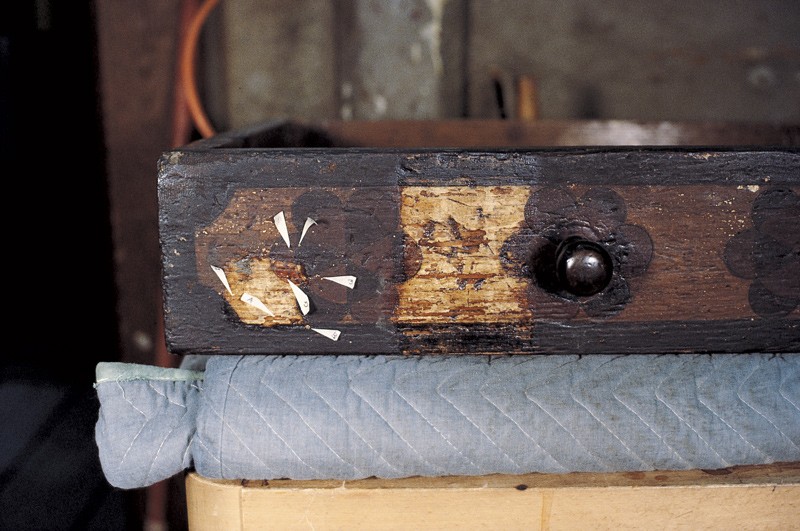
The uppermost drawer, which was much shinier than the others, had the most areas of active paint loss. Comparisons of the samples taken from all three drawers showed that the top one had an additional layer of comparatively fresh shellac (identified based on its characteristic orange autofluorescence in reflected ultraviolet light). It is likely that this layer of shellac was applied in an attempt to counteract flaking of the paint, but instead, it exacerbated loss because the coating shrank as it dried. During this phase of analysis, 35mm photographs of all the cross-section samples were taken with a camera mounted to the top of the microscope. These photographs were compared and annotated in an attempt to identify the variations in the paint and coating histories on all the finished surfaces of the cupboard (fig. 5).

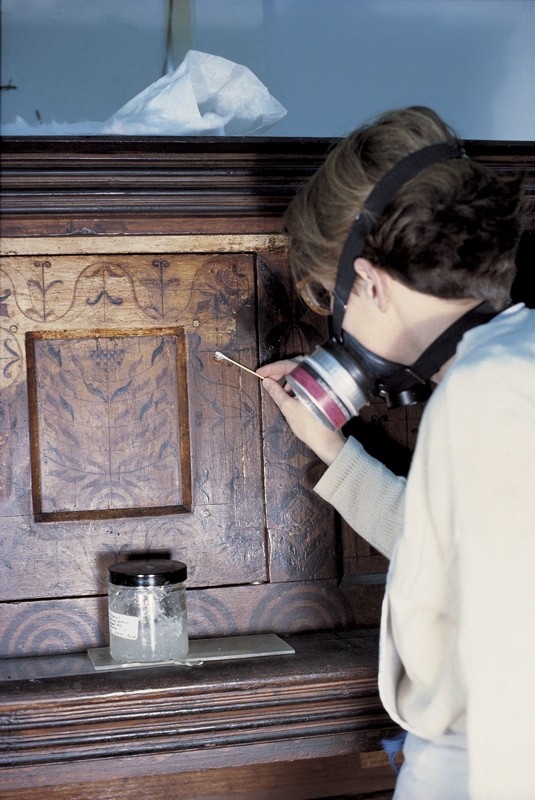
The Hannah Barnard cupboard arrived at the conservation center of the Society for the Preservation of New England Antiquities in late 1991. After determining the original paint scheme, I took additional samples to experiment with the efficacy of different solvents (figs. 6, 7). These cross sections showed that it was possible to safely remove the later coatings but still retain the original paints and the earliest plant resin varnish layer, using a high-viscosity isopropanol gel applied with cotton swabs and wadding. As the cleaning slowly progressed, the brightly colored decoration that was revealed proved how closely the designs and palette of this cupboard related to the other two chests (fig. 8). The worst areas of damage on the court cupboard were primarily owing to use, particularly on the edges of drawers, on the bottom rail of the paneling of the upper case, and the area around the door lock for the upper panel, which had been replaced and filled in. The original paints were still remarkably intact under their brown mask.[8]

The biggest surprise to come to light during the cleaning process was the original color of the columns. The slow process used to remove the varnish enabled me to stop quickly if an original painted area appeared to be more readily soluble, but as the cleaning progressed, it became clear that, unlike all the other painted areas of the cupboard, the maple columns had lost most of their decoration. Fortunately, enough original paint remained in the recessed areas of the turnings to verify that the columns had originally been painted a distinctive robin’s egg blue, a color not found anywhere else on the cupboard. This paint was composed primarily of white lead with a small proportion of the artificial basic copper carbonate pigment blue verditer and the newly invented pigment Prussian blue.[9]

After consultations with the advisory committee organized to oversee the cleaning process, I isolated the original areas of blue with a protective barrier and inpainted the surface around them with a blue glaze of modern gouache. This glaze could never be mistaken for the original because of the modern acrylic resin barrier coat that separates it from the original oil-bound blue paint and because the gouache contains titanium white, a pigment not in use before 1910. Clearly, the stripped wood columns, with their traces of original blue paint, did not reflect the original intent of this totemic object. The expense of the blue pigments used to decorate them also suggested they were intended to stand out against the paints on the upper case.[10]

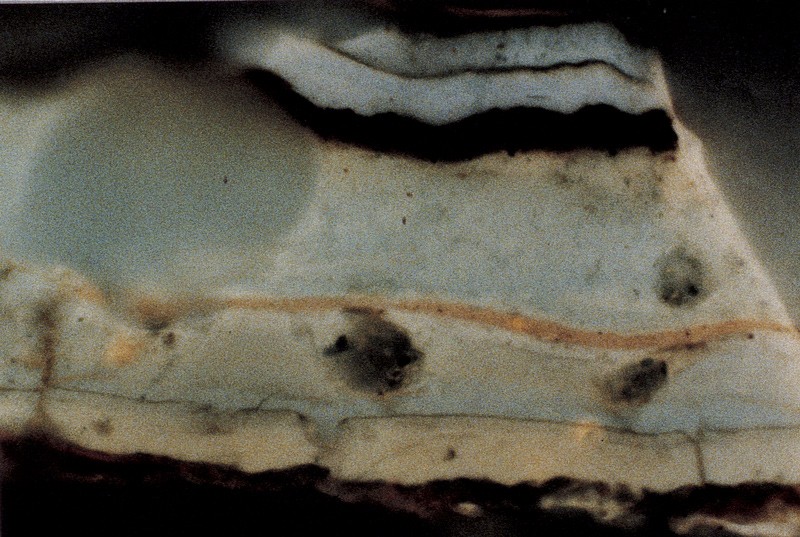
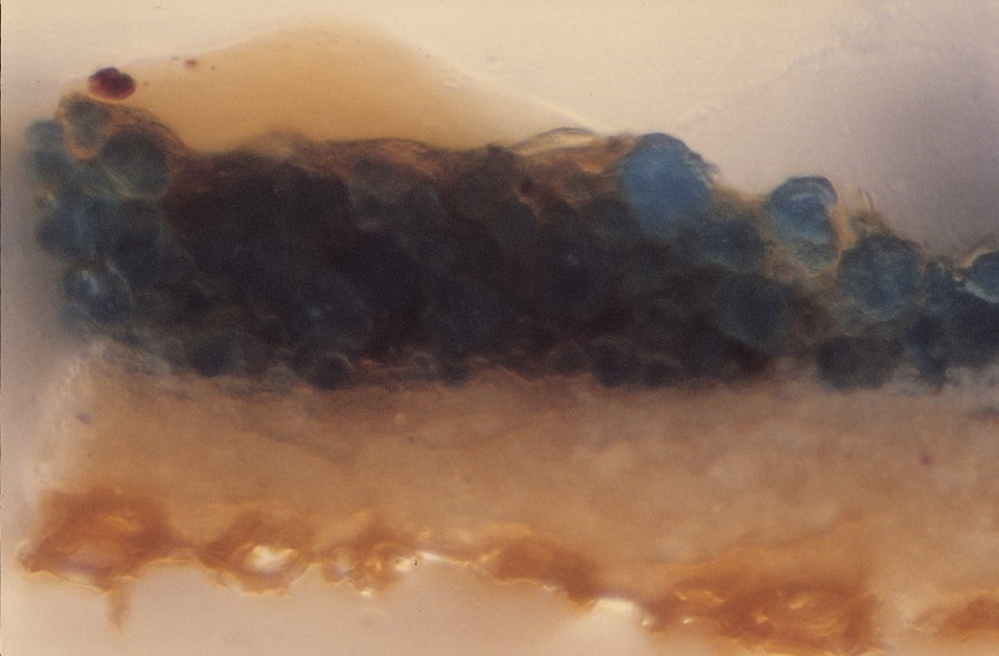
Pigment analysis using polarized light microscopy techniques showed that the white background paint on the court cupboard is composed primarily of white lead and calcium carbonate; the red-orange areas are red lead and vermilion; the maroon areas are primarily red ochre and lampblack; and the blue-green areas (now degraded to almost black) are almost pure blue verditer (fig. 9). The characteristic white autofluorescence of the binding media surrounding the rounded blue verditer particles documents the presence of a plant resin varnish, which would have made this blue-green layer quite glossy and slightly translucent. This resinous binder also contributed to the significant darkening of this originally brilliant decoration.

The iron oxide–based reds and the carbon-based black are very stable pigments, and those areas have darkened primarily owing to the degradation of the oil-binding medium and embedded grime. Vermilion, like that used for the orange triangles and half circles in the compass-drawn designs on the drawer fronts, can darken from prolonged exposure to light, although the mechanism of this phenomenon is not fully understood. The presence of vermilion is significant, as it was an expensive pigment in the early eighteenth century and typically would have been confined to use on easel paintings, especially in a rural area like the Connecticut River valley of Massachusetts. Thus, although it was possible to successfully remove the later brownish coatings from the painted surfaces of the court cupboard, some of the colors, particularly the red-orange and blue-green areas, have permanently darkened.[11]

I deliberately did not clean a 4-by-6-inch area of the upper case (behind the right column) so as to preserve the complete finish history of the cupboard as it transpired from the date of manufacture until 1991 and provide a test site for future analysis. Samples taken from that site in 2008 confirm that some of the more protected areas of the upper-case designs were not overpainted brown and maroon like the drawer fronts and were not varnished as frequently as the lower case.[12]

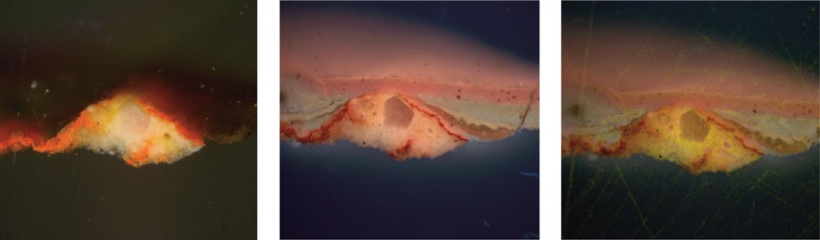
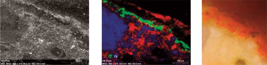
The stratigraphy in a cross section (sample HB-1) from an area of red-painted decoration reveals that the red-orange paint was thinly applied on the white base coat and that both layers are now fractured and disrupted. In reflected ultraviolet light it is apparent that the first layer on top of this red-orange paint is a degraded plant resin varnish layer, identifiable by its characteristic bright white autofluorescence under reflected ultraviolet light. There is no dirt separating the red-orange paint and the plant resin varnish directly on top of it, suggesting the first varnish is the original coating. The second coating is pigmented shellac, identifiable by its pale orange autofluorescence and the tiny particles of pigment in suspension. The third coating appears to be a grayish pigmented varnish, followed by two more layers of clear plant resin varnish. The uppermost coating is a thick layer of pigmented shellac. Distinct films of dirt separate each application of shellac and plant resin varnish, and there is a layer of oil on the surface of the uppermost coat of pigmented shellac (fig. 10). SEM-EDS analysis of this same cross-section sample confirmed that primary elements in the white background paint are lead with calcium and silicon, and the primary elements in the red-orange paint are mercury and lead (fig. 11). This corroborates the initial identification of the white background paint as white lead and calcium carbonate and the red-orange paint as vermilion and red lead.[13]

The Painted Surfaces of the Winterthur Chest
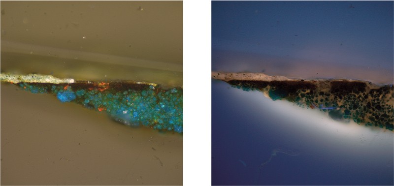
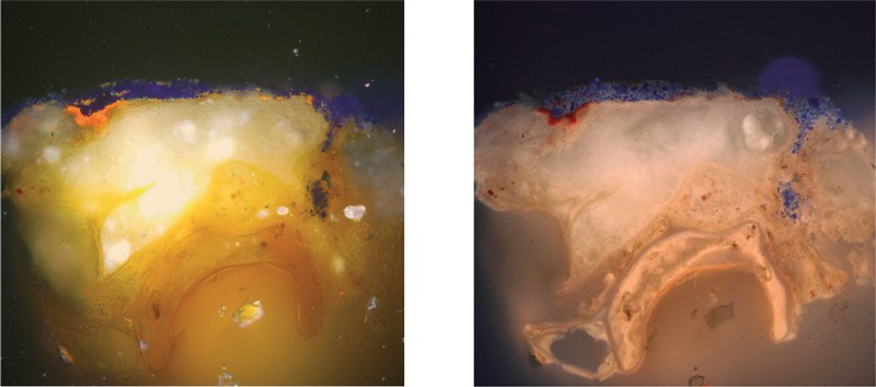
In the early phase of investigating the paints on the Hannah Barnard cupboard, the Hadley chest acquired by du Pont in 1926 was examined and sampled to identify how the paint schemes on the two objects related (fig. 12). This research was revealing, as it showed that in some areas two layers of finely ground grayish green overpaint remained on top of a fractured and degraded plant resin varnish coating (fig. 13). Additionally, where the leaf and vine decoration had degraded to almost black, cross-section analysis confirmed that the same type of pure blue verditer paint on the Hannah Barnard cupboard was used to create what must have been a jewel-like blue-green color when it was first applied to the fronts of the stiles and drawers of the chest.

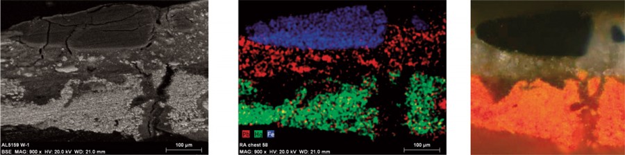
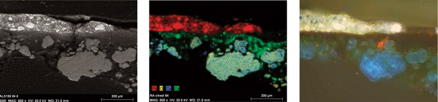
In 2008 I selected areas of the painted decoration on the Winterthur Museum chest for sampling and reexamination. This small group of samples shows even more strongly the relationship between the paints on the Hannah Barnard court cupboard and the chest at Winterthur. It also reveals some significant new information about the first layer of opaque overpaint on the latter object. In two samples (W-1, W-3) there is a worn layer of degraded plant resin varnish on top of the first decorative paint layer, which was likely the original varnish applied to this chest. Above this varnish coating is a notably coarse and unevenly ground grayish blue paint with exceptionally large Prussian blue particles unevenly distributed throughout the layer (fig. 14). SEM-EDS analysis of a sample (W-1) from a bright orange–painted design confirms the use of vermilion and red lead, and it also proves that the coarse overpaint is composed of white lead and very large particles of Prussian blue (fig. 15). The irregular dispersion of chunky pigments in the grayish blue overpaint is characteristic of an early hand-ground paint, and it strongly suggests that the polychrome designs were first painted over before the end of the eighteenth century.[14]

In cross section the original blue-green layer of blue verditer suspended in a resinous binder in sample W-3 is identical to samples from comparable designs on the court cupboard (fig. 16). This was confirmed with SEM-EDS analysis (fig. 17). Another sample (W-4) taken from an area that now appears maroon in color must have originally been a deeper, richer red, as it is composed of red lead and red ochre, much like the comparable areas sampled on the court cupboard. The similarities in composition, thickness, pigment dispersion, and binding media components suggest the Hannah Barnard court cupboard and the Winterthur chest were painted using the same paint materials, and possibly by the same hand.[15]

Regrettably, the cleaning in 1926 appears to have caused the ghostlike appearance of most of the polychrome designs on the drawer fronts. The white lead–based background paint that can be seen in the cross-section samples is also barely discernible on close examination of the surfaces. Examination of the surface also revealed that the white paint was mostly removed from the exposed background areas surrounding the brightly colored compass-drawn designs. Thus, the background now appears more tan in color, rather than its original bright white.

The Paint Evidence on the SW Chest
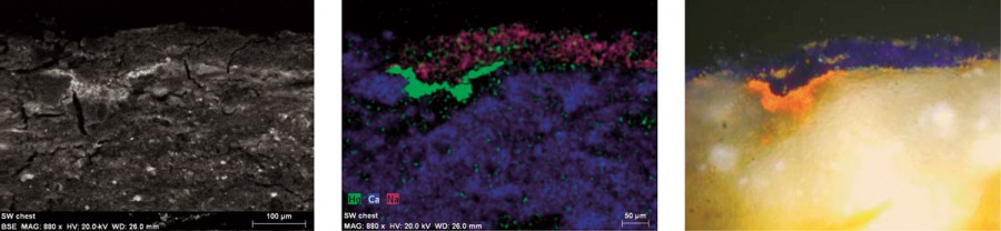
The chest at the Memorial Hall Museum now has the brightest palette of this group of three polychrome case pieces (fig. 18), but a considerable amount of the current paint scheme is not original. On the front feet the orange-painted triangular decorations extend down beyond where the original white background paint has been completely worn away, and the bright blue outlines on the drawer fronts cover dents and abrasions on the exposed outer edges. There are also bright blue areas of the compass-drawn designs on the drawer fronts that seem to relate to the fresher blue paint on the edges of the drawers, and there are flat black areas of the compass-drawn circular decorations that do not appear in similar areas of the other two pieces.

Cross-section analysis of a small group of samples taken before the 1993 Hadley chest exhibition revealed that the blue paint around the edges of the drawers is much later than the object’s date of manufacture. The blue is emulsion paint, whereas the original paint on the rest of the chest is oil-bound, and the former extends over dirty surfaces. The cross section visible in figure 19 (sample SW-1), which was taken from the blue rectangular decoration on the right front panel, indicates that this finely ground artificial ultramarine was applied on top of the original worn and cracked red-orange decorative layer and white base coat. SEM-EDS analysis further demonstrated that the blue overpaint contains sodium, aluminum, silicon, and potassium (components of artificial ultramarine), whereas the remnants of red-orange paint contain mercury and lead (fig. 20).[16]

The identification of artificial ultramarine in the blue overpaint is significant, since that pigment was not commercially available until about 1826. Equally important, the presence of vermilion and red lead in the red-orange decoration below the blue paint proves that the same combinations of pigments were used for the red-orange decoration on the SW chest, the Hannah Barnard cupboard, and the Winterthur Museum chest.[17]

Recent analysis also revealed more about the bright blue-green paint originally used for the leaf and vine decorations, as well as one of the alternating colors in the compass-generated motifs. Many of the areas of black overpaint on the SW chest cover the original, now quite degraded, blue-green paint, which is composed primarily of blue verditer in a resinous binder. It is likely that by the late nineteenth century, when George Sheldon purchased the SW chest, the formerly blue-green decorative areas were, in fact, quite black owing to degradation and the accumulation of grime layers. Identical passages of blue-green, using the same type of pure blue verditer bound in plant resin and oil, are visible in samples taken from the geometric and leaf and vine motifs of both the Hannah Barnard court cupboard and the Winterthur chest.[18]

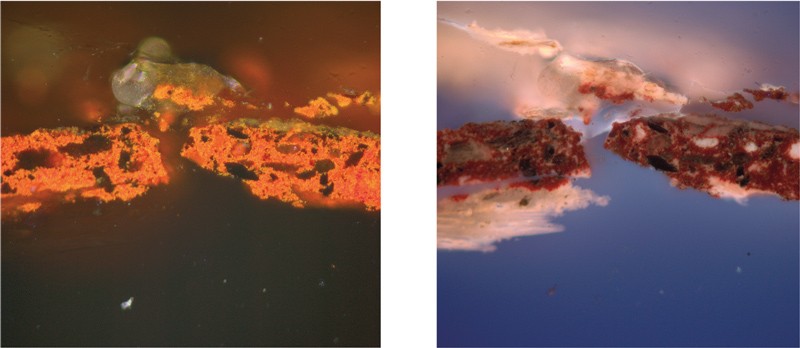
Other painted designs on the SW chest simply look questionable, such as the orange triangles at the bottoms of the front legs. The cross section from the orange-painted triangle on the left front leg shows a surprisingly coarsely ground paint applied over worn, dirty wood fibers (fig. 21). This unevenly mixed, deep orange paint could be easily mistaken for a hand-ground, eighteenth-century paint. However, the original red-orange paint, composed primarily of red lead and vermilion, is finely ground and evenly mixed (characteristic of paint composed of inherently tiny particles of pigment). This allows us to conclude that not only were many areas of the SW chest painted over, but certain colors and passages, such as the original red-orange compass-drawn designs and the black drawer borders, were radically altered.

This overpainting was likely done in 1893, based on the chronology described by Zea and Flynt in their catalogue Hadley Chests. They noted that George Sheldon donated the chest to the Memorial Hall Museum in December 1892, and the following November the Pocumtuck Valley Memorial Association’s assistant curator Janitor Mary P. Wentworth (1835–1901) received $1.50 “for painting and cleaning [a] dresser.” Zea and Flynt surmised that the “dresser” was the SW chest because it is the only conspicuously overpainted object in that institution’s collection, and the process of cleaning and painting would have taken about a week.[19]

The Paint Evidence on the RA Chest
Probably made in Hadley or Hatfield, the RA chest was donated to Memorial Hall by Chester Graves Crafts in 1887 (fig. 22). Although relatively conventional in form, it survives with most of its original paint scheme intact. To compare the composition of its paint with that of the Hannah Barnard cupboard and related chests, I examined three samples taken by Historic Deerfield architectural conservator William Flynt.[20]

The sample from a beveled portion of the left stile, which was protected by the edge of the bottom drawer, indicates that there is only one layer of finely ground, oil-bound black paint on top of the wood. This cross section contains a remnant of a plant resin varnish coating on top of the original black paint, but it is not possible to tell from the layer sequence if this ­varnish is original. The sample from the upper left corner of the left panel provides more intriguing information. In this cross section there is a thin layer of finely ground red-pigmented paint on top of the wood, followed by an equally thin layer of plant resin varnish (fig. 23). There is no evidence of a film of dirt trapped between the red paint and the degraded varnish, ­suggesting that it is an original or very early protective coating. There is also an amorphous, translucent whitish layer on top of the varnish, which is likely a later accumulation of paste wax. Polarized light microscopy pigment analysis and SEM-EDS indicate that the pigments in the red layer are primarily red ochre with some red lead.[21]

The original black and deep red paints on the RA chest are much thinner than the paints on the three polychrome pieces, suggesting that these coatings were not meant to obscure the figure of the oak completely. The use of lampblack for the black paint and the combination of red ochre and red lead for the red paint are typical of inexpensive paints made of stable pigments that might have been used by a joiner or housepainter. The overall palette of the paints on the RA chest has darkened owing to the accumulation of dirt, the yellowing of the plant resin varnish, and the oil-binding media, but the colors are still readily identifiable as a deep red and black.

Paint Analysis Past and Future
Analytical work on the paint on the Hannah Barnard cupboard, subsequent conservation performed in the early 1990s, and more recent cross-section microscopy and SEM-EDS findings have helped clarify relationships between the original paints used on that object and the two related chests. These investigations reveal that it is possible to analyze the coatings applied to furniture made centuries ago, confidently determine how the surfaces may have looked when new, and ascertain how those coatings have degraded and changed over time.

One of the intriguing questions arising from this study is: How long did the extraordinarily bright and whimsical decorations on the three polychrome pieces remain in place? The exceedingly coarsely ground, grayish blue paint directly on top of the polychromy on the chest illustrated in figure 12 suggests that it might have been painted over before the end of the eighteenth century (fig. 14). By contrast, there is no physical evidence to suggest that the decorations on the SW chest were ever completely painted out (fig. 19), although some areas were selectively repainted. And although the Hannah Barnard cupboard had turned an overall brown by the early twentieth century, the comparative cross-section evidence suggests that the later touch-ups were intended to enhance the by-then obscured decorations, rather than cover them completely.

Another question pertains to survival: Why have only three polychrome case pieces from the Hadley-Hatfield area come to light, whereas more than 250 conventional carved and joined chests have survived? The former were undoubtedly expensive objects, so it is likely that fewer were originally made. In addition, the brilliance and the distinctly identifiable style of the decoration on the Hannah Barnard cupboard, the SW chest, and the Winterthur chest may have made that class of object less desirable when tastes began to change. One can only hope that other examples survive with their decoration intact below later coatings. As this article has shown, the technology for understanding and conserving such painted forms exists and continues to improve.[22]

ACKNOWLEDGMENTS
For assistance with this article, I would like to thank Mark Anderson, Amelia Bagnall, Edward A. Chappell, Wendy Cooper, Clara Deck, Mary Fahey, Suzanne L. Flynt, William Flynt, Natasha Loeblich, Catherine Matsen, and Stephanie Rabourdin-Auffret.

[1]

For recent interpretations of the Hannah Barnard cupboard, see Philip Zea and Suzanne L. Flynt, Hadley Chests (Deerfield, Mass.: Pocumtuck Valley Memorial Association, 1992), pp. 20–24; and Laurel Thatcher Ulrich, “Furniture as Social History: Gender, Property, and Memory in the Decorative Arts,” in American Furniture, edited by Luke Beckerdite and William N. Hosley (Hanover, N.H.: University Press of New England for the Chipstone Foundation, 1995), pp. 39–68.

[2]

Antiques 26, no. 5 (November 1934): 168. Zea and Flynt, Hadley Chests, p. 20. Henry Francis du Pont purchased the chest from Mark LaFontaine. Antiques 10, no. 3 (September 1926): 189–90.

[3]

The samples (about 200 microns in size with paints attached to a few wood fibers) were removed with a scalpel from the edges of losses and joins to avoid intruding into intact paint surfaces. They were permanently cast in polyester resin in mini ice cube trays and polished with sandpapers (grits 220, 400, and 600) and MicroMesh silica-embedded polishing cloths (grits 1,500–12,000) to expose the cross sections and provide smooth, flat surfaces for analysis and photography.

[4]

This initial research was coordinated with Henry Ford Museum curator Michael Ettema and conservator Ralph Wiegandt. The samples were examined at the Society for the Preservation of New England Antiquities (SPNEA, now Historic New England) Conservation Center in Waltham, Massachusetts. Biological fluorochrome characterization was conducted using an Olympus BH-T Series II fluorescence microscope and the fluorochrome stains triphenyl tetrazolium chloride for the presence of carbohydrates, fluorescein isothiocyanate for proteins, and Rhodamine for oils. See Richard C. Wolbers, Cleaning Painted Surfaces: Aqueous Methods (London: Archetype, 2000), pp. 167–83. An advisory committee for the conservation of the Hannah Barnard court cupboard was convened to discuss and oversee the conservation treatment. This committee included Philip Zea, Suzanne L. Flynt, Michael Ettema, William Hosley, and Richard Nylander. I undertook this work while a furniture conservator at SPNEA. 

[5]

Catherine Matsen, unpublished SEM-EDS report for Susan L. Buck, November 21, 2008, p. 1: “All six cross-section samples were reduced in width so as to provide the proper working distance for better imaging once mounted on a carbon stub and placed in the SEM chamber. The excess casting resin was cut from the side opposite the cross-section with a jeweler’s saw and mounted to a carbon stub with double-sided carbon tape adhesive. Carbon paint was applied over the side and top surfaces of the casting resin, without covering the sample itself. The samples were examined using the Topcon ABT-60 scanning electron microscope with an accelerating voltage of 20kV, working distance of 26mm, and sample tilt of 20°. The EDS data was analyzed with the Bruker X-flash detector and microanalysis Quantax model 200 with Esprit 1.8 software. Back-scattered electron (BSE) images, energy dispersive spectroscopy (EDS) spectra and elemental maps were gathered of all samples.”

[6]

This practice of oiling the furniture was described by Ralph Wiegandt, who discontinued it when he joined the staff of the Henry Ford Museum.

[7]

Analysis was conducted using an Olympus BH-T Series II fluorescence microscope with a polarizing light base and a dedicated 35mm camera. Susan Buck to Philip Zea and Suzanne L. Flynt, July 21, 1992.

[8]

The cross-section evidence suggested that a prudent cleaning approach would involve several steps. The first would remove the oily dressing residues with a targeted water-based enzyme cleaning system using the enzyme lipase in a water-based gel. After this cross-linked oily material was gone, it appeared that it would be possible to slowly remove the two overpaints, the pigmented shellac layers, and the plant varnish coatings with thickened solvent gels that would restrict the cleaning effect to the uppermost layers. Ultimately, the controlled cleaning tests on one drawer front and one upper panel showed that it was possible to slowly undercut the uppermost oily residues and the brown overpaints using an isopropanol gel, which softened and solubilized the plant resin varnishes and shellac layers below the overpaints. This process required numerous applications of the gel, wiping away the residues with cotton, and then clearance with quick applications of first isopropanol and then odorless mineral spirits as free solvents. This made it possible to get down to the varnish layer that remained directly on top of the original paints without removing either it or the original paints. The isopropanol gel was made with isopropanol, Carbopol 954, Ethomeen C-25, and water.

[9]

Blue verditer is noted as a housepainter’s color in the seventeenth century (Rutherford J. Gettens and Elizabeth West Fitzhugh, “Azurite and Blue Verditer,” in Artists’ Pigments: A Handbook of Their History and Characteristics, edited by Ashok Roy, 2 vols. [Washington, D.C.: National Gallery of Art, 1993], 2: 31). Prussian blue is described as “the earliest of the synthetic colors” first made in Berlin in about 1704 (Rutherford J. Gettens and George L. Stout, Painting Materials: A Short Encyclopedia [New York: Dover, 1966], pp. 149–50). 

[10]

Gettens amd Stout, Painting Materials, p. 161. Titanium white was put into regular production between 1916 and 1919.

[11]

Rutherford J. Gettens, Robert L. Feller, and W. T. Chase, “Vermilion and Cinnabar,” in Roy, ed., Artists’ Pigments, 2: 167.

[12]

Henry Ford Museum objects conservator Clara Deck took three additional samples for this analysis in September 2008. This work was coordinated through that museum’s head of preservation, Mary M. Fahey. The cupboard is now permanently exhibited in the furniture section of the museum.

[13]

The conclusion that oil components existed in the paint layers and on the surface of the uppermost pigmented shellac layer was based on the positive reactions for unsaturated lipids with the fluorochrome stain 2, 7 dichlorofluorescein. SEM-EDS analysis provided solid evidence of the elemental composition of the white and red-orange layers: “Calcium (Ca) and lead (Pb) are the primary elements in the ground and suggests the presence of chalk (calcium carbonate, CaCO3) and lead white (basic lead carbonate, 2PbCO3·Pb(OH)2). A large, translucent particle—likely chalk—is present in the ground. With spot EDS analysis of the red paint layer, calcium, lead and mercury (Hg) are the strongest elements detected to suggest a composition of chalk, red lead (Pb3O4) and vermilion (HgS)” (Catherine Matsen, unpublished SEM-EDS report, p. 5).

[14]

Wendy Cooper, Mark Anderson, and Stephanie Rabourdin-Auffret helped provide access to the Winterthur chest. “Spot EDS analysis of the first-generation red paint of Sample W-1 detects mercury and sulfur to indicate the presence of vermilion. Elemental mapping shows the presence of silicon also in the first-generation red paint (likely present as silica, SiO2). With elemental mapping at 900X magnification, low levels of lead and calcium detected in the red paint suggest red lead (Pb3O4) and chalk (CaCO3) are present. Low levels of aluminum and sodium suggest a clay is present, potassium may be present in the paint’s organic binder. The paint layer over the first red paint generation is a lead-containing paint (likely lead white, 2PbCO3·Pb(OH)2) with iron-containing (likely Prussian blue, Fe4[Fe(CN)6]3) blue particles suspended within” (Matsen, unpublished SEM-EDS report, p. 3).

[15]

Cross-section microscopy and polarized light microscopy analysis conducted by me and SEM-EDS analysis confirm the similarities in paint composition. SEM-EDS analysis of sample SW-1 showed that “Copper and oxygen are detected in association with one another in the blue particles of the lowest paint layer. This combination suggests the blue pigment is azurite or a synthetic blue verditer (both 2CuCO3·Cu(OH)2). A calcium-containing layer above the blue pigment particles is not expressly seen in visible light but is evident under ultraviolet light. This may be an oil varnish layer (that contains chalk) applied to protect the blue paint. The white paint above this layer contains predominantly lead, likely as lead white. Small blue particles are seen within this paint layer and correspond to iron detected with elemental mapping; this suggests the presence of Prussian blue pigment” (Matsen, unpublished SEM-EDS report, p. 4). 

[16]

Cross-section microscopy with biological fluorochrome staining was used to identify the comparative paint layer stratigraphies and to characterize the organic components in each layer. SEM-EDS analysis helped distinguish the original paints from the blue overpaint: “Spot EDS analysis and elemental mapping indicate lead and mercury are the main elements detected in the orangish-red paint, again likely present as red lead and vermilion. Aluminum, potassium, calcium and iron x-ray lines are weakly detected likely as clay, chalk and iron oxide red—either as intentional additives to the paint or due to contamination from polishing the cross-section. The second generation blue paint is composed of sodium, aluminum, silicon, lead, potassium and calcium. The blue color and combination of elements detected suggests the blue pigment to be ultramarine blue (Na8-10Al6Si6O24S2-4). Calcium may be present as chalk, lead as lead white and potassium may be present in the paint’s organic binder” (Matsen, unpublished SEM-EDS report, p. 3).

[17]

Joyce Plesters, “Ultramarine Blue, Natural and Artificial,” in Roy, ed., Artists’ Pigments, 2: 37.

[18]

Polarized light and cross-section microscopy analysis I conducted of samples taken from darkened blue-green areas of all three objects showed the blue-green paints to be nearly identical in pigment particle size and distribution and the thickness of the layers.

[19]

Zea and Flynt, Hadley Chests, p. 22. 

[20]

Suzanne L. Flynt allowed access to the chests for sampling.

[21]

SEM-EDS analysis provides important information about the deep red layer and the accumulation of whitish material above the surface: “Detection of elements in the thin, red paint layer was not possible with spot EDS; instead, the elemental composition is best understood with elemental mapping. At 1500X magnification iron (Fe) is the primary element detected in the thin, red paint layer, likely as iron oxide red (Fe2O3). Sulfur is detected in association with iron though the phase of this combination of elements is unknown. The appearance of the discontinuous layer above the red paint and detection of sodium (Na), silicon (Si), calcium (Ca), potassium (K), and aluminum (Al) suggests a clay or dirt composition; this may simply be the accumulation of furniture polish from over the years” (Matsen, unpublished SEM-EDS report, p. 3).

[22]

Zea and Flynt, Hadley Chests, p. 5.

American Furniture 2009

Show all Figures only
Contents


  • [1]

    For recent interpretations of the Hannah Barnard cupboard, see Philip Zea and Suzanne L. Flynt, Hadley Chests (Deerfield, Mass.: Pocumtuck Valley Memorial Association, 1992), pp. 20–24; and Laurel Thatcher Ulrich, “Furniture as Social History: Gender, Property, and Memory in the Decorative Arts,” in American Furniture, edited by Luke Beckerdite and William N. Hosley (Hanover, N.H.: University Press of New England for the Chipstone Foundation, 1995), pp. 39–68.

  • [2]

    Antiques 26, no. 5 (November 1934): 168. Zea and Flynt, Hadley Chests, p. 20. Henry Francis du Pont purchased the chest from Mark LaFontaine. Antiques 10, no. 3 (September 1926): 189–90.

  • [3]

    The samples (about 200 microns in size with paints attached to a few wood fibers) were removed with a scalpel from the edges of losses and joins to avoid intruding into intact paint surfaces. They were permanently cast in polyester resin in mini ice cube trays and polished with sandpapers (grits 220, 400, and 600) and MicroMesh silica-embedded polishing cloths (grits 1,500–12,000) to expose the cross sections and provide smooth, flat surfaces for analysis and photography.

  • [4]

    This initial research was coordinated with Henry Ford Museum curator Michael Ettema and conservator Ralph Wiegandt. The samples were examined at the Society for the Preservation of New England Antiquities (SPNEA, now Historic New England) Conservation Center in Waltham, Massachusetts. Biological fluorochrome characterization was conducted using an Olympus BH-T Series II fluorescence microscope and the fluorochrome stains triphenyl tetrazolium chloride for the presence of carbohydrates, fluorescein isothiocyanate for proteins, and Rhodamine for oils. See Richard C. Wolbers, Cleaning Painted Surfaces: Aqueous Methods (London: Archetype, 2000), pp. 167–83. An advisory committee for the conservation of the Hannah Barnard court cupboard was convened to discuss and oversee the conservation treatment. This committee included Philip Zea, Suzanne L. Flynt, Michael Ettema, William Hosley, and Richard Nylander. I undertook this work while a furniture conservator at SPNEA. 

  • [5]

    Catherine Matsen, unpublished SEM-EDS report for Susan L. Buck, November 21, 2008, p. 1: “All six cross-section samples were reduced in width so as to provide the proper working distance for better imaging once mounted on a carbon stub and placed in the SEM chamber. The excess casting resin was cut from the side opposite the cross-section with a jeweler’s saw and mounted to a carbon stub with double-sided carbon tape adhesive. Carbon paint was applied over the side and top surfaces of the casting resin, without covering the sample itself. The samples were examined using the Topcon ABT-60 scanning electron microscope with an accelerating voltage of 20kV, working distance of 26mm, and sample tilt of 20°. The EDS data was analyzed with the Bruker X-flash detector and microanalysis Quantax model 200 with Esprit 1.8 software. Back-scattered electron (BSE) images, energy dispersive spectroscopy (EDS) spectra and elemental maps were gathered of all samples.”

  • [6]

    This practice of oiling the furniture was described by Ralph Wiegandt, who discontinued it when he joined the staff of the Henry Ford Museum.

  • [7]

    Analysis was conducted using an Olympus BH-T Series II fluorescence microscope with a polarizing light base and a dedicated 35mm camera. Susan Buck to Philip Zea and Suzanne L. Flynt, July 21, 1992.

  • [8]

    The cross-section evidence suggested that a prudent cleaning approach would involve several steps. The first would remove the oily dressing residues with a targeted water-based enzyme cleaning system using the enzyme lipase in a water-based gel. After this cross-linked oily material was gone, it appeared that it would be possible to slowly remove the two overpaints, the pigmented shellac layers, and the plant varnish coatings with thickened solvent gels that would restrict the cleaning effect to the uppermost layers. Ultimately, the controlled cleaning tests on one drawer front and one upper panel showed that it was possible to slowly undercut the uppermost oily residues and the brown overpaints using an isopropanol gel, which softened and solubilized the plant resin varnishes and shellac layers below the overpaints. This process required numerous applications of the gel, wiping away the residues with cotton, and then clearance with quick applications of first isopropanol and then odorless mineral spirits as free solvents. This made it possible to get down to the varnish layer that remained directly on top of the original paints without removing either it or the original paints. The isopropanol gel was made with isopropanol, Carbopol 954, Ethomeen C-25, and water.

  • [9]

    Blue verditer is noted as a housepainter’s color in the seventeenth century (Rutherford J. Gettens and Elizabeth West Fitzhugh, “Azurite and Blue Verditer,” in Artists’ Pigments: A Handbook of Their History and Characteristics, edited by Ashok Roy, 2 vols. [Washington, D.C.: National Gallery of Art, 1993], 2: 31). Prussian blue is described as “the earliest of the synthetic colors” first made in Berlin in about 1704 (Rutherford J. Gettens and George L. Stout, Painting Materials: A Short Encyclopedia [New York: Dover, 1966], pp. 149–50). 

  • [10]

    Gettens amd Stout, Painting Materials, p. 161. Titanium white was put into regular production between 1916 and 1919.

  • [11]

    Rutherford J. Gettens, Robert L. Feller, and W. T. Chase, “Vermilion and Cinnabar,” in Roy, ed., Artists’ Pigments, 2: 167.

  • [12]

    Henry Ford Museum objects conservator Clara Deck took three additional samples for this analysis in September 2008. This work was coordinated through that museum’s head of preservation, Mary M. Fahey. The cupboard is now permanently exhibited in the furniture section of the museum.

  • [13]

    The conclusion that oil components existed in the paint layers and on the surface of the uppermost pigmented shellac layer was based on the positive reactions for unsaturated lipids with the fluorochrome stain 2, 7 dichlorofluorescein. SEM-EDS analysis provided solid evidence of the elemental composition of the white and red-orange layers: “Calcium (Ca) and lead (Pb) are the primary elements in the ground and suggests the presence of chalk (calcium carbonate, CaCO3) and lead white (basic lead carbonate, 2PbCO3·Pb(OH)2). A large, translucent particle—likely chalk—is present in the ground. With spot EDS analysis of the red paint layer, calcium, lead and mercury (Hg) are the strongest elements detected to suggest a composition of chalk, red lead (Pb3O4) and vermilion (HgS)” (Catherine Matsen, unpublished SEM-EDS report, p. 5).

  • [14]

    Wendy Cooper, Mark Anderson, and Stephanie Rabourdin-Auffret helped provide access to the Winterthur chest. “Spot EDS analysis of the first-generation red paint of Sample W-1 detects mercury and sulfur to indicate the presence of vermilion. Elemental mapping shows the presence of silicon also in the first-generation red paint (likely present as silica, SiO2). With elemental mapping at 900X magnification, low levels of lead and calcium detected in the red paint suggest red lead (Pb3O4) and chalk (CaCO3) are present. Low levels of aluminum and sodium suggest a clay is present, potassium may be present in the paint’s organic binder. The paint layer over the first red paint generation is a lead-containing paint (likely lead white, 2PbCO3·Pb(OH)2) with iron-containing (likely Prussian blue, Fe4[Fe(CN)6]3) blue particles suspended within” (Matsen, unpublished SEM-EDS report, p. 3).

  • [15]

    Cross-section microscopy and polarized light microscopy analysis conducted by me and SEM-EDS analysis confirm the similarities in paint composition. SEM-EDS analysis of sample SW-1 showed that “Copper and oxygen are detected in association with one another in the blue particles of the lowest paint layer. This combination suggests the blue pigment is azurite or a synthetic blue verditer (both 2CuCO3·Cu(OH)2). A calcium-containing layer above the blue pigment particles is not expressly seen in visible light but is evident under ultraviolet light. This may be an oil varnish layer (that contains chalk) applied to protect the blue paint. The white paint above this layer contains predominantly lead, likely as lead white. Small blue particles are seen within this paint layer and correspond to iron detected with elemental mapping; this suggests the presence of Prussian blue pigment” (Matsen, unpublished SEM-EDS report, p. 4). 

  • [16]

    Cross-section microscopy with biological fluorochrome staining was used to identify the comparative paint layer stratigraphies and to characterize the organic components in each layer. SEM-EDS analysis helped distinguish the original paints from the blue overpaint: “Spot EDS analysis and elemental mapping indicate lead and mercury are the main elements detected in the orangish-red paint, again likely present as red lead and vermilion. Aluminum, potassium, calcium and iron x-ray lines are weakly detected likely as clay, chalk and iron oxide red—either as intentional additives to the paint or due to contamination from polishing the cross-section. The second generation blue paint is composed of sodium, aluminum, silicon, lead, potassium and calcium. The blue color and combination of elements detected suggests the blue pigment to be ultramarine blue (Na8-10Al6Si6O24S2-4). Calcium may be present as chalk, lead as lead white and potassium may be present in the paint’s organic binder” (Matsen, unpublished SEM-EDS report, p. 3).

  • [17]

    Joyce Plesters, “Ultramarine Blue, Natural and Artificial,” in Roy, ed., Artists’ Pigments, 2: 37.

  • [18]

    Polarized light and cross-section microscopy analysis I conducted of samples taken from darkened blue-green areas of all three objects showed the blue-green paints to be nearly identical in pigment particle size and distribution and the thickness of the layers.

  • [19]

    Zea and Flynt, Hadley Chests, p. 22. 

  • [20]

    Suzanne L. Flynt allowed access to the chests for sampling.

  • [21]

    SEM-EDS analysis provides important information about the deep red layer and the accumulation of whitish material above the surface: “Detection of elements in the thin, red paint layer was not possible with spot EDS; instead, the elemental composition is best understood with elemental mapping. At 1500X magnification iron (Fe) is the primary element detected in the thin, red paint layer, likely as iron oxide red (Fe2O3). Sulfur is detected in association with iron though the phase of this combination of elements is unknown. The appearance of the discontinuous layer above the red paint and detection of sodium (Na), silicon (Si), calcium (Ca), potassium (K), and aluminum (Al) suggests a clay or dirt composition; this may simply be the accumulation of furniture polish from over the years” (Matsen, unpublished SEM-EDS report, p. 3).

  • [22]

    Zea and Flynt, Hadley Chests, p. 5.