In December 2015 a delegation of ceramics educators from the North Carolina Pottery Center of Seagrove ventured to Milwaukee, Wisconsin, to meet with members of the Chipstone Foundation. The purpose of the meeting was to brainstorm about possible efforts to raise the national visibility of the programming offered by the Pottery Center. Attendees from the pottery center were Mark Hewitt, president of the board of directors; David Steumpfle, exhibition chairman; Lindsay Lambert, executive director; and Emily Lassiter, educational program manager and project coordinator. The Chipstone hosts included Jon Prown, executive director; Sarah Carter, curator and director of research; and me, as editor of Ceramics in America.
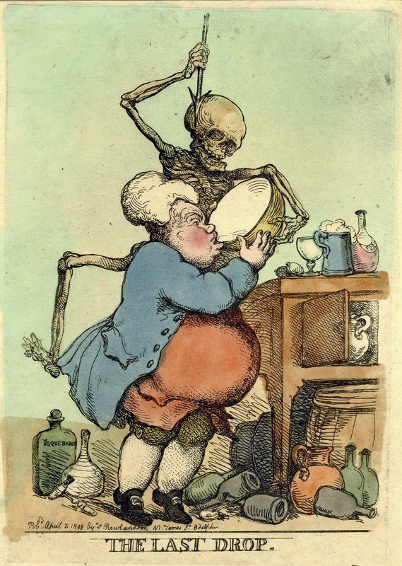
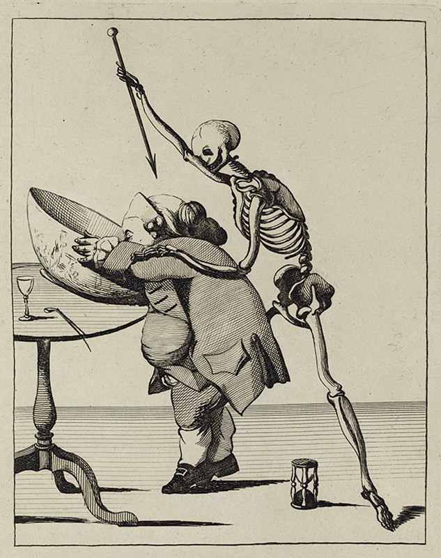
That initial discussion led to a group think tank at the Pottery Center in June 2016, to which a wide range of concerned parties were invited to discuss furthering and diversifying the programming mission of the center. From those meetings, the concept of a collaboration between Chipstone and the Pottery Center was realized with the proposal of an exhibition that paired contemporary potters with historical drinking vessels within the Chipstone Foundation’s collection of seventeenth- and eighteenth-century American, British, and German ceramics. The theme of the proposed exhibition, “The Last Drop,” was derived from a series of lateeighteenth-century engravings satirizing the deadly perils of alcohol consumption, especially punch drinking, a fashionable social practice commonly known for leading to excessive imbibing.
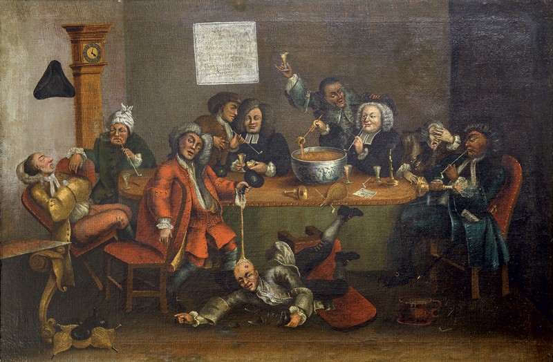
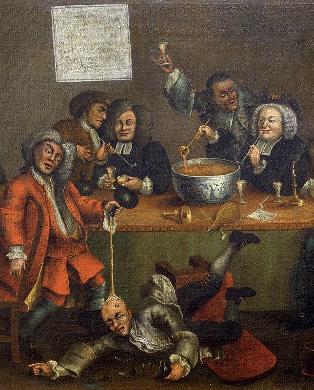
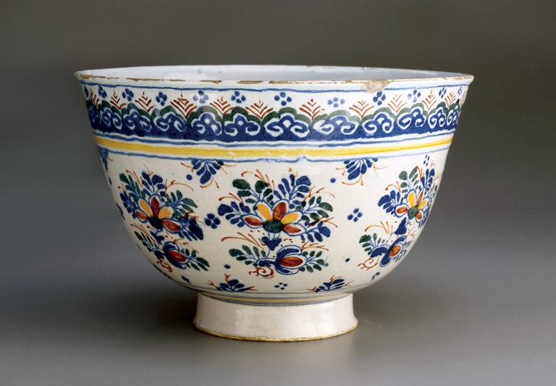
For thousands of years potters have fashioned clay vessels for the ritual consumption of fermented and distilled beverages. Those vessels reflect not only the technological and stylistic concerns of their time and place, but also a wide variety of cultural celebrations and proscriptions related to the making, distribution, ceremonial usage, and consumption of alcoholic drinks. William Hogarth’s A Midnight Modern Conversation, first painted in 1732, is both a satire and an important cultural snapshot of the punch ritual (fig. 3). The all-male participants are shown in an extreme state of inebriation surrounding a large delft punch bowl decorated with Chinese figures, the centerpiece of most early-eighteenth-century London social clubs (fig. 4). Like many other social customs of the period, the experience of taking punch was shared by England and the American colonies. Punch drinking entered Anglo-American culture in the mid-seventeenth century and reached a pinnacle of formalization in the mid-eighteenth century. Over the course of the eighteenth century highly embellished punch bowls involving period fashions and decorative schemes were created for this ritual by countless potters.
Modern potters can expand their appreciation of the decorative and aesthetic choices made in the past not only by investigating historical technologies (the material constraints of using slip, for one), but also by inquiring into the social, religious, political, and economic context of the makers. For example, ceramics have always carried social and ideological messages, some quite explicit. Insight into these messages is what we were seeking when we invited seventeen leading contemporary American potters each to create new ceramic work inspired by a specific seventeenth- or eighteenth-century English (or one German) drinking vessel from the Chipstone Foundation’s exemplary collection. We were not necessarily looking for a reproduction or a facsimile, but rather an interpretive or conceptually based object that reflects upon historic materials, designs, and processes interpreted through the lens of cultural commentary, societal views on alcohol consumption, and the ongoing role of fired clay in alcohol-related wares.
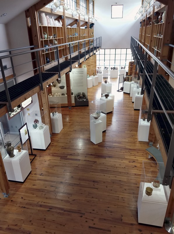
On December 9, 2017, “The Last Drop: Intoxicating Pottery, Past and Present” opened at the North Carolina Pottery Center of Seagrove, in collaboration with the Chipstone Foundation and Ceramics in America (fig. 5). Each artist’s contribution was shown alongside the antique object they had chosen from the Chipstone collection. The exhibit opened with my overview of the project, followed by a reception featuring a period-punch demonstration by Daniel Ackermann of the Museum of Early Southern Decorative Arts. During the course of the exhibit, which ran through April 7, 2018, Emily Lassiter organized several talks and demonstrations, including a slide presentation by Catawba Valley potter Kim Ellington, historic slip-decorating demonstrations with Mary Farrell and Andrew Dutcher, and a final slide presentation by Michelle Erickson.
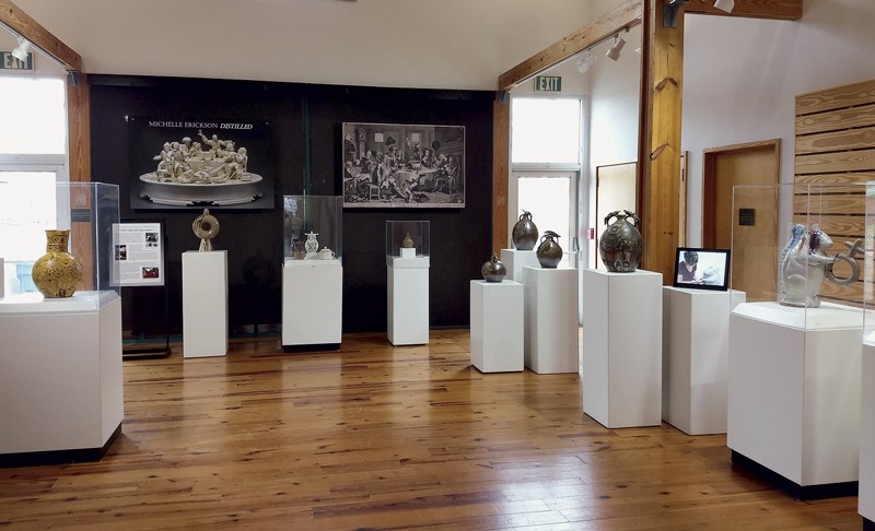
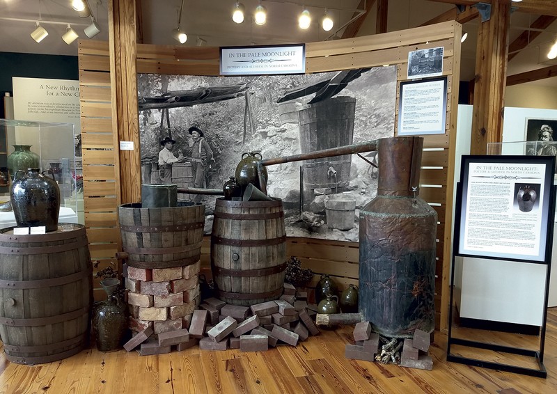
As part of the Last Drop project, two supporting shows were held in the adjoining gallery spaces of the Pottery Center. One displayed the work of Michelle Erickson, arguably the leading practitioner in the arena of historically inspired ceramic art in this country (fig. 6). She showed recently created work made during an internship at the STARworks Center for Creative Enterprise in Star, North Carolina, and related didactic videos about her historical approach to creating ceramics. The other exhibit, titled “In the Pale Moonlight: Pottery and Alcohol in North Carolina” and curated by ceramics historian and collector Stephen Compton, addressed the ceramic heritage of North Carolina as it related to alcohol production and consumption (fig. 7). Each of these exhibitions added an vital dimension to the overall project and each is summarized in subsequent articles in this year’s journal.
The following brief essays by the contributing artists are firsthand narratives from “The Last Drop” regarding the exercise of reinterpreting historical ceramic drinking vessels from a contemporary perspective. It is the artists’ actual creations that are the most important statements of this attempt to explore Anglo-American ceramic traditions of the seventeenth and eighteenth century. Ceramics in America 2018 serves as only partial documentation for the project; for a more comprehensive record, Lindsay Lambert created a website devoted to the project that is maintained by the Pottery Center. Readers are referred to www.thelastdropproject.org/home/ for fuller biographies of each of the participating artists as well as photo documentation of their processes. Both the exhibit and the website have received national attention and commentary, and certainly succeeded in the ongoing quest to raise the visibility of the important resources and programming of the North Carolina Pottery Center.
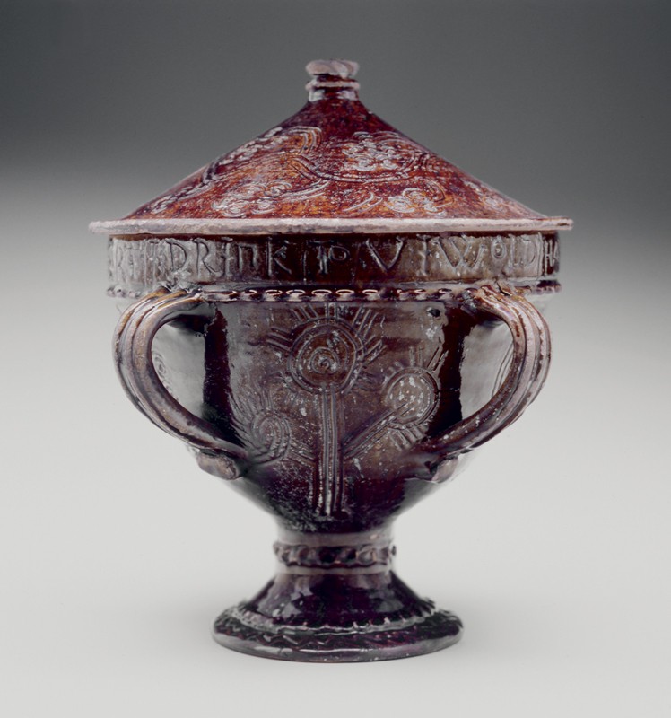
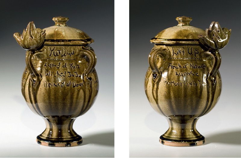
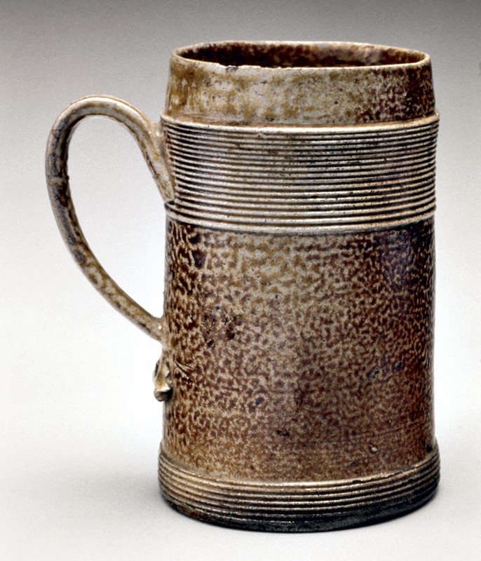
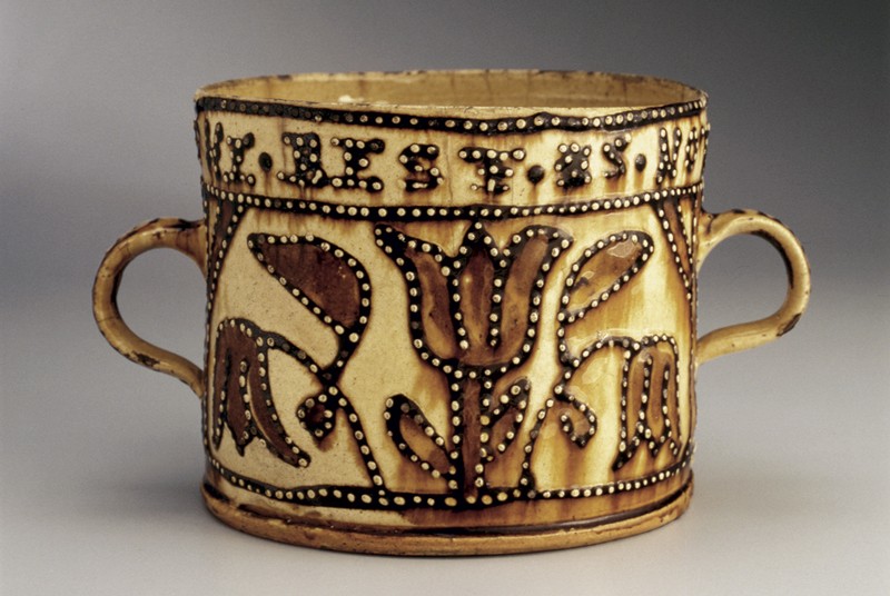
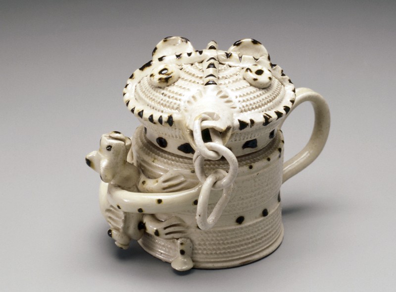
KIM ELLINGTON As I looked through the photographs of drinking vessels to choose from for the Last Drop project, my eyes kept returning to the whistle cup with cover (fig. 8). I had never seen or heard of such a vessel. The whistle cup looked to me to be the epitome of a celebration mug. With a vow to be merry inscribed around the rim and a whistle to blow for more, what else could you ask for in a drinking cup? However, I am puzzled as to why the cup is lidded. Is it to keep flies out? Perhaps it’s just a nice way to give the cup a meaningful presence.
My first consideration for selecting an object to make was size, and I decided on one liter. To drink a liter of alcohol per cup typically involves a celebration of some sort. I then considered the shape. I have made a typical, straight-walled, German-style beer mug for many years. I decided to make this pot a rounded shape to reference femininity and our Earth. The feminine expression is becoming very important in the twenty-first century.
This cup rests on a pedestal (fig. 9). Finding the correct proportion of pedestal to cup required some trial and error. I made the pedestal separate in a variety of heights and widths to see what would work best with the cup. The handles were next. I decided on pulled lug handles rather than a strap handle. An important aspect of the handle style is that it also provides the perch for the whistle. With so many components to the piece, I did not want the handles to draw particular attention. I chose to make a rounded lid and to use glass for decoration. Using pieces of glass to make “runs” in the glaze is an important component of the Catawba Valley tradition in which I work. I used the inverted shape of the pedestal for the knob.
A crucial decision was what shape and size to make the whistle. I wanted something that would definitely nail the piece down as an early-twenty-first-century object. After much consideration (and beer), I decided on using the Twitter logo as a whistle. The whistle is the primitive and Twitter the modern way of getting attention. The critical part of making a whistle is the placement and angle of the whistle hole and the mouthpiece alignment. Fortunately, the shape of a bird accommodates those concerns. I made a few “blank” whistles of different shapes and sizes to learn the technique. Once the final form was made, the wings were cut from a slab and attached.
After drying to leather hard and testing the whistle, the bird was attached to a handle.
Next were the inscriptions. Around the collar, separated by the handles, I wrote this verse: “Lift Up / Put Down / Too Much / A Clown.” Depending on where you start reading this, it can have different connotations. I wanted the inscriptions to make twenty-first-century references to drinking alcohol. I put a post on Facebook asking for input on the project, hoping to garner something clever from social media. All of the fun responses were rooted in twentieth-century alcohol lore. However, the dangers and heartbreak of alcohol abuse, which are timeless, were also expressed. The nearest I could come to referring to the dark side of alcohol use was my reference to a clown. I have an aversion to writing of death and suffering on a vessel used for celebration. While seeking more lighthearted inspiration, I visited the website of a local craft-beer store. While reading the names of available beer, I realized that they represent the current attitude toward alcohol consumption, so around the main body of the cup I inscribed the names of current craft brews made in North Carolina, Colorado, and California. Around the bottom of the handles is inscribed a verse: “Fill it up from / Bottom to the Top / Drink it all Down / To the Very Last Drop.”
This Twitter Whistle Cup is glazed in the traditional Catawba Valley alkaline glaze. As Dave the Slave made evident with his early-nineteenth-century pottery making, this glaze has the ability to enhance an inscription. In the making of this cup, I thought of how profound his work is in the context of his era and aspired to tap into just a tiny part of that inspiration.
Kim Ellington was born in 1954 and grew up in Hickory, North Carolina. He lives and works in Vale, N.C., home of the Catawba Valley pottery tradition.
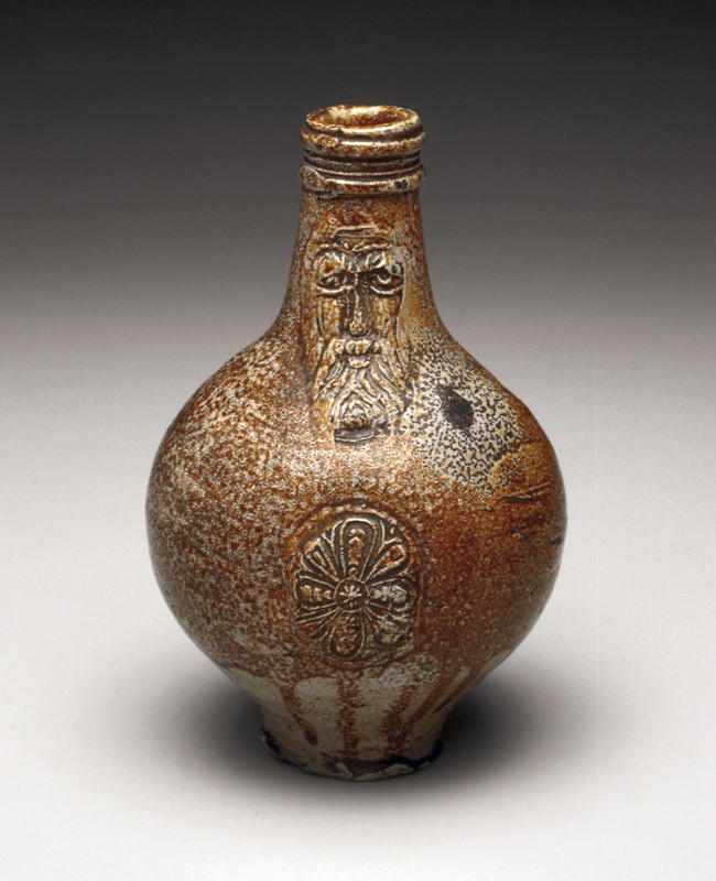
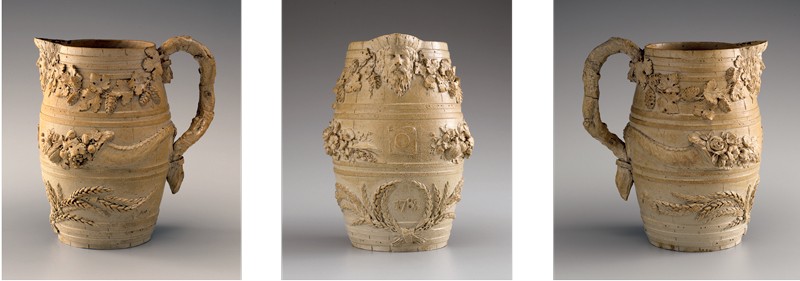
DAN FINNEGAN My work stands at the intersection of traditional and contemporary pottery. I am in constant pursuit of old ideas that I can integrate into my own work. Layering a variety of influences and techniques is how I strive to move the tradition forward. I have had a long fascination with the pot I chose to reinterpret (fig. 10). I first knew it to be called a bellarmine, but these days it is called a Bartmann, German for “Bearded Man.” I trained at the Winchcombe Pottery in the late 1970s and most of my ideas of form still have their roots in the aesthetics of that place. Medieval German salt glaze and seventeenth-century English slipware are the touchstones of the pots made there, and both Michael Cardew and Ray Finch made magnificent cider jars that showed the roots of those old pots.
These Bartmanns were salt-glazed and wood-fired, exactly the firing method that I use for my own work. I recently switched my clay body to one produced by STARworks Ceramics, and its character also lends itself to making a pot that reflects the old one.
As much as I love old pots I’ve never been interested in making reproductions. The invitation to take an old historic pot that I admire and reinterpret it was an exciting one! That’s basically my practice every day in my own studio, taking old ideas and making them new.
I knew right away that I would replace the sprig of the bearded man’s face with one of my own face. I have worn a beard to match those old-timers all my life and it seemed too obvious to ignore. That part was easy, but what would this new pot be used for in its new iteration?
I took a long time on that question. The convergence of the slow food movement crossed my mind . . . maybe it could be a container for vinegar? Or even cider, a drink that has become wildly popular and one that I know only too well from some country boys in England? Of course, all kinds of craft alcohols are enjoying a revival, small batches of gin and vodka are popular and distilleries are sprouting up around Virginia, including one in my hometown of Fredericksburg. This seemed to be the answer—a distillery provides imagery that would have been fun to make sprig molds for and has a local connection—but, in the end, they make bourbon and I’m a scotch drinker. It wouldn’t have been right!
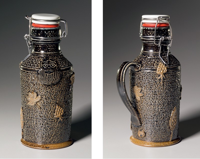
While I am an occasional scotch drinker, I am a regular beer drinker and the blossoming of microbreweries eventually swayed me to consider making this pot for beer. The Bartmann was ubiquitous in its day and nowadays every hipster beer drinker has his or her own growler, which really made it the obvious choice for this project (fig. 11).
I love the big-bellied form as it swoops into a long lovely neck and I made several of those, but I also thought I should consider the cylindrical form of the contemporary glass growlers. I really liked it after I made it and it was perfectly suited to the new texture and slip that I’ve been developing in my current work. It is a sleek form that mimics the growlers. I also made the handle larger, like a growler.
Next, I needed to carve a few very low-relief images called sprig molds. I carved images of the flower and leaf of a hop plant and one of a barley sheaf as well as one of my own image. I waxed these sprigs to resist the black-and-blue slip that I applied. The natural color of the clay made them stand out nicely.
I slipped the round-bellied ones more traditionally. They have their own charm but look too close to the original.
The last challenge was to calculate the shrinkage rate of the clay to adapt the stopper mechanism after it was fired. Stoneware clay shrinks approximately 13 percent at 2400°F, but those are pretty fine tolerances. The finished pieces were close, and with the help of a friend we adapted the stopper for the final fit.
The pots were fired for 20 hours in my wood-burning kiln. I introduce table salt into the chamber when things get nice and hot; the sodium vapor reacts with the silica in the clays and creates glass. Variations occur depending on where they are placed in the chamber.
I made several pieces to make sure that I could provide at least one that I felt good about—this was fortunate, because several of them developed problems with the sprigs lifting off the surface of the pot as they dried. An alarming situation! I was lucky to get a couple of really good ones. I hope that you agree.
Dan Finnegan maintains his studio in Fredericksburg, Virginia. His pottery career extends more than forty years.
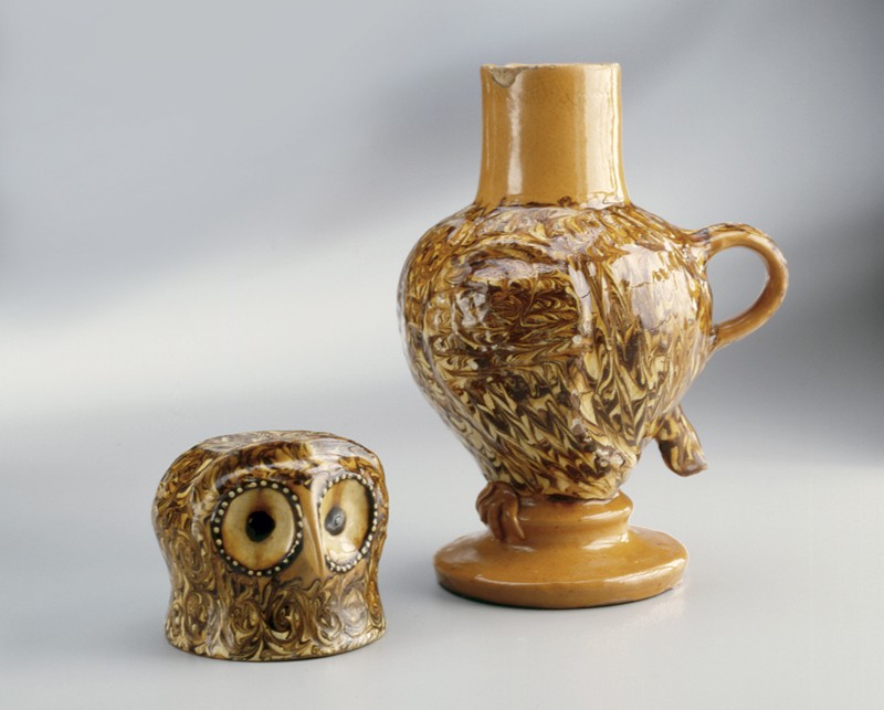
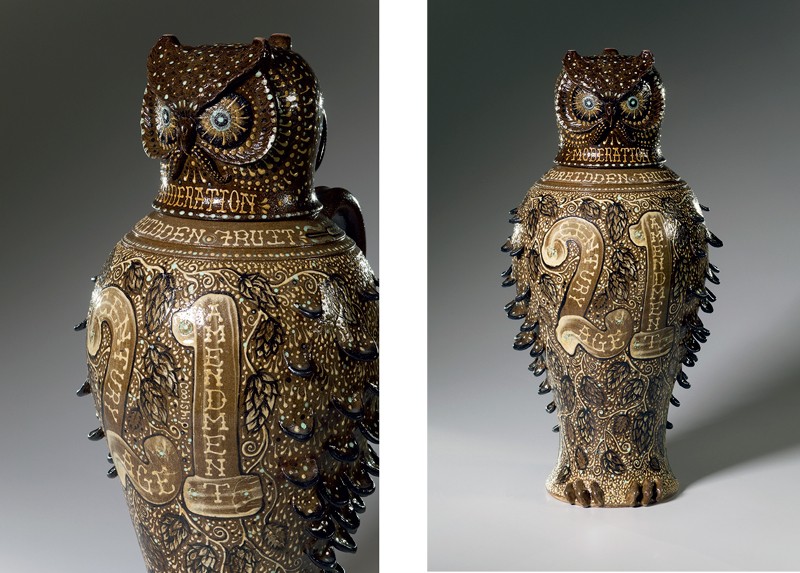
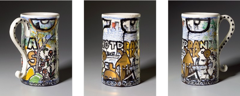
MICHAEL GATES For the Last Drop project I chose to work on a reinterpretation of the Chipstone Foundation’s Staffordshire slipware owl drinking vessel (fig. 12). It seemed to be a natural choice, as I recently have been using lots of slips and some underglazes in my work. I decided to stay somewhat close to the basic form of the Staffordshire owl but with some changes, such as adding a handle to the mug/lid and making it footed to allow for the top of the owl’s head to be glaze covered (fig. 13). I also changed the shape so it had a more flowing form and made it oversize. I attached flattened clay tabs for feathers to make the wings and tail stand out more. I couldn’t resist a little sculptural work on the owl’s face to make it more owl-like, and of course a mustache! I planned to use the surface of the body as a canvas to explore the complex subject of alcohol in the twenty-first century.
The number “21” kept turning up as I took a look back at alcohol consumption in the U.S. over the past century with prohibition and the 21st amendment repealing it. Problems with underage drinking seemed to increase when the drinking age was raised from 18 to 21. This made alcohol a forbidden fruit and more interesting to the youth, causing an underage binge-drinking problem in the U.S. Countries with more relaxed laws, or no laws, on the subject have not had the same problems. I slip-trailed “forbidden fruit” on the front of the vessel, along with “century,” “age,” “amendment,” and even “blackjack” as references to the big “21.” An outline of black underglaze gave a little more of a pop.
The symbolic wise old owl seems an appropriate one to comment on the ritual use of alcohol throughout history. Evidence that the need to transcend everyday life through intoxicants such as alcohol has been found throughout history. The owl may have once been asked, “How many drinks does it take to get to the center of one’s self?” The world may never know, but I imagine the wise old owl would stress moderation. Under the owl’s beak, I wrote in a light-colored slip the word “moderation.” However, with such a large, oversize drinking vessel the owl could have easily been giving a wink, wink. I can tell you from personal experience that moderation in drinking is very important to remember while working with clay. Alcohol can be a great uniter that helps people open up socially and make great connections with others, but excess can also be a great destroyer of relationships and health. I have seen this firsthand with the loss of two of my closest friends due to alcohol-related health problems. I thought some about this dualistic nature of alcohol in American society while working on the project.
Many people have enjoyed the craft-beer revolution of the twenty-first century. It was sparked when Jimmy Carter legalized home brewing in 1978, and the craft renaissance shifted into full throttle early in the twenty-first century. I decided to paint a large “21” in slip on the front of the vessel, along with hops buds and a vine running and curling throughout. I also scattered a few brewing terms, some barley, and other ingredients throughout, creating an elaborate and busy surface design in an effort to represent the complexity of craft brewing today. With a greater variety of hops and malt and combinations with fruit, grain, herbs, flowers, and techniques, a brewer today can create any type of beer. The possibilities are endless, just as they are when you have a ball of clay in front of you. As an occasional bartender and somewhat of a beer connoisseur, I find this facet of alcohol in the twenty-first century to be the most radically changing, and an obvious choice to include on the vessel.
With the amount of slip and underglaze on the piece, I needed to use a transparent glaze and lots of control in the firing process. Therefore, I glazed with a thinned Alberta slip and a coat of clear over it, then fired at mid-high temperature in the electric kiln. The result was a graphically strong piece with lots of highly visible detail to convey my ideas.
Michael Gates is a descendant of the Reinhardt family of potters, who produced traditional utilitarian wares in the Catawba River Valley for generations. Michael draws on this heritage when making his contemporary creations in Elk Park, North Carolina.
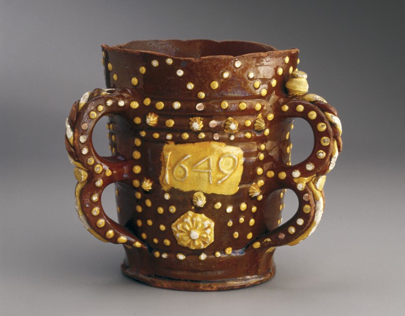
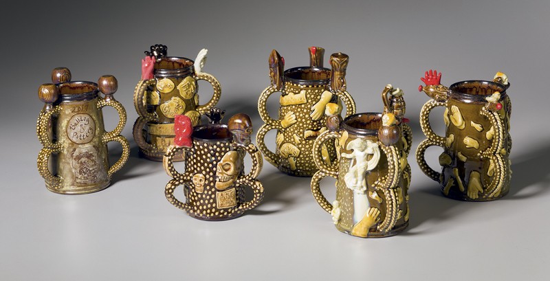
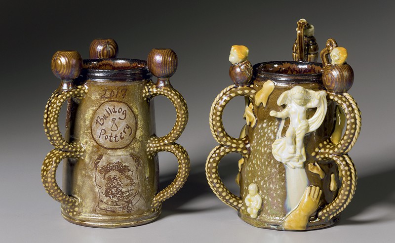
BRUCE GHOLSON AND SAMANTHA HENNEKE A tyg is an English communal drinking vessel with multiple handles that allow for ease of use, for members of a group to readily pass the vessel to one another (fig. 14). We honored this vessel’s functional design by making it with the traditional triple handles and covered them with slip-trailed dots, finials, and sprig attachments (fig. 15).
We immediately approached this project thinking in terms of multiples and thought that for our conceptual tyg party each guest would have their own celebratory tyg. With what we know today about the possible outcome of passing infections, we know that the days of drinking from a communal drinking vessel around the brewhouse table are over. We selected six individual tygs that represent the dialogue we had during this project.
Bruce threw the tygs, extruded and pulled the handles, and carefully applied the twisted porcelain rope down the handle’s middle. Samantha then slip-dotted the entire handle. We created sprig molds from carved plaster and porcelain clay; we molded doll hands out of silicon rubber, and skulls from Fimo clay. We unpacked our gifted 1960s antique plaster molds and newly purchased molds of doll hands. We slip-cast, press-molded, and reassembled those objects for the finials that rest on top of each tyg’s triple handles, and the sprigs that are applied to the sides of the vessels (fig. 16).
The tyg grew in popularity during the 1500s and 1600s along with the rise of alehouses, which spread across the hamlets of Great Britain. Around 1577 there were about 24,000 alehouses in England, a ratio of roughly one alehouse for every 142 inhabitants. By the 1630s there were around 50,000, a ratio of one alehouse for every 95 inhabitants. (Mark Hailwood, Alehouses and Good Fellowship in Early Modern England [Woodbridge, Suffolk: Boydell Press, 2014], pp. 3–4.)
Our ceramic model, the English tyg, is dated 1649, which is an auspicious year in English history. It is considered the beginning of the interregnum for that period, an interruption in the government of monarchy by a republic called the Commonwealth, much like the election of 2016 may have heralded an interregnum of government for the United States by attempting to replace our democracy with rule by an oligarch. Because of the intensity of politics today, we have found ourselves, for the first time in our work, consciously broaching social commentary with our imagery and decoration.
In researching a little bit of English history during the 1500s and 1600s, we discovered that the last major outbreak of the Black Plague in London took place during the summer of 1665, when an estimated 100,000 people died, about a quarter of London’s population. We learned about plague doctors and the plague’s vector—the flea, which spread the Yersinia pestis bacteria. How would a dangerous epidemic impact us now, with the current instability in health care?
In honor of the human condition and our desire to clink our glasses together and offer “cheers” to one another’s goodwill, health, happiness, and prosperity, we sought to define the word “cheers” in different languages. This commonality of human cultures and the universal desire to be a part of a social group often leads to communal drinking and celebrating with one another. Some countries translate their drinking salutation as “Good health to you!,” such as South Africa’s “Gesondheid,” or France’s “À Votre Santé!” Because of their sprigs and finials, clinking together our tygs would be a delicate proposition, one probably best avoided or done ever so gently.
Hands became a theme for some of the tygs because of the recent obsessions about hand size in the social-political content of our national media. Differing meanings for hands as symbols and in heraldry led us to one of our favorite songs by the Australian singer-songwriter (among many other talents) Nick Cave, written in 1994:
You’re one microscopic cog
in his catastrophic plan
Designed and directed by
his red right hand.
This led to more research and trying to understand the concepts and confusions of right and left, conservative and liberal, dexter and sinister. It begs the question, what does our current government of the conservative right have in common with dexter besides sociopathic tendencies?
“One idea leads to another” is a phrase that we embraced during this project and it continued to lead us all the way to the end. When posting on Facebook an image of one of the tygs that came out of the kiln, the phrase “A Hard Rain’s a-Gonna Fall” came to mind. We were inspired to Google the song by Bob Dylan, read the lyrics, and watched his rendition on YouTube that was taped in 1963. We found this to be apropos to present-day commentary and now has become a full-blown reality with the forty-fifth president and followers blaming fake news and disseminating their own information of alternative facts. “Where the pellets of poison are flooding their waters,” wrote Bob Dylan, suggesting that this is “all the lies people are told.”
Bruce Gholson and Samantha Henneke moved to Seagrove, North Carolina, in 2000 to open their studio and retail shop, Bulldog Pottery. Although their styles differ, they often collaborate in the creation of their works.
FRED JOHNSTON AND CAROL GENTITHES Fred’s statement Ceramic vessels have been telling us stories since the Neolithic period. At the contemporary moment in ceramics, the curious studio potter continues to create glorious manifestations in clay. I delight in the ways a pot can capture a moment in history, whether it be nuanced or boldly overt. It can reveal so much about an area and its people, their thoughts and beliefs. We once visited the National Gallery in Athens, Greece, where I saw a group of ancient amphoras that pictorially told the story of the Amazon warrior women from Greek mythology. These vase paintings depicted the Amazons as heroic and courageous fighters, riding horses and shooting arrows. I learned the Amazons drank an alcoholic concoction made from fermented mare’s milk called koumiss, which they used in rituals around the campfire. So the story of alcohol and pottery is a very old one and continues to play itself out to this day.
The Seagrove area has had a long and contentious relationship with alcohol. After the Civil War, during the reconstruction of the South, the federal government set up licensed whiskey-making stills and charged an excise tax on each gallon, which treasury agents would then collect. It has been said that for every licensed still there were two illegal ones. Whiskey-making was a quite profitable affair if you didn’t get caught. A lot of whiskey was sold to Northern markets. That meant they needed runners who took the whiskey from the hamlet of Black Ankle (North Carolina) and the Seagrove area into Northern cities, doubling the price before delivering it to the client. It also meant they needed potters to make jugs to put the whiskey in. From after the Civil War until World War II there were many potters making jugs for the whiskey trade around Montgomery, Randolph, and Moore Counties. I have a local friend who took me to an old kiln site back in the woods where bootleggers made not only whiskey but also their own jugs. An old potter named Waymon Cole told me that he and his father took a wagonload of jugs to an isolated place, left the wagon, and upon returning the jugs were gone and money was under the seat. Eventually, glass mason jars eliminated the need for potters’ help.
After sixty-some years the town of Seagrove finally approved the sale of alcohol. I recently had a pottery customer ask me where he and his friends could go to have a beer and some ice cream. I thought it sounded like an interesting combination so I delighted in telling him, “no problem, just go to the grocery store in Seagrove.”
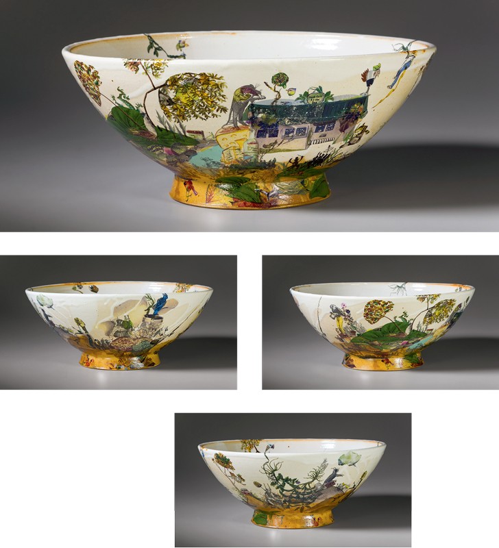
Carol’s statement As an avid reader of classical literature with a strong affinity for the narrative decoration on the seventeenth–eighteenth-century British porcelain ware, I immediately knew that the punch bowl would serve as my canvas to depict a contemporary tale (fig. 17). My favorite writers of the seventeenth and eighteenth centuries include Lewis Carroll, Charles Dickens, Anthony Trollope, Jonathan Swift, and Voltaire. A Tale of Two Cities, Alice in Wonderland, Gulliver’s Travels, and Candide are the specific prose that fueled my imagination for this project, the common thread being fanciful characters in a concocted storyline that reflect the social and political events of the times. As for illustrators in the similar time frame, I tip my hat to William Hogarth, J. J. Grandville, and Honoré Daumier, who were gifted pictorial satirists and caricaturists capturing the eternal humor and absurdities of humanity. I have many talented spirits floating through my mind, nudging me to pay them homage. I give to you my story line as depicted on our punch bowl (fig. 18):
A Tale of Two Counties
It was the best of times, it was the wurst of times in the pottery town known as Seagrove, wurst because the grocery store was subject to leave our lands and take all its sausage, produce, and commodities with it. Set in the twenty-first century, a little over a year ago to be exact, the town was divided on the sale of alcohol. If voted no, it would crush the grocery store, which was losing customers to the city of Asheboro (11 miles north) where both alcohol and groceries could be purchased in one store, one swipe. If voted yes, it would raise the town revenue, give the pottery customers their long-awaited amenities while keeping the grocery store afloat. Knit one, purl two, enter the Naysayers planting “Vote No” signs firmly in Seagrove’s terra firma. The problem was they didn’t have jurisdiction in the town’s terrain as they lived one county over. Not even a county really, since the town fits neatly within a 0.7 square mile. There you have it. Seagrove got the Yea vote despite the opposition. Father Time was on our side. Look for him on the punch bowl with his fishing pole as he reflects, “It is a far, far better thing that I do than I have ever done; no more need to stall for me.”
In 1997 Johnston and his wife, ceramic artist Carol Gentithes, established Johnston & Gentithes Studio and Gallery in downtown Seagrove, NC. They recently built a new studio, which is located one mile south of Seagrove in the hamlet of Whynot.
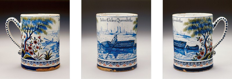
KATE JOHNSTON For my form I chose a “jug,” in the American vernacular sense. It’s not a serving pot with a spout, like the piece from Lambeth (fig. 19), but rather a wide-based, narrow-necked storage-and-transport vessel that wouldn’t suggest pouring except for the handle (fig. 20). This particular form is produced from glass for the Carlo Rossi wine brand, which is cheap and thus attractive to those who are looking for quantity. The followers of Dionysus, the Greek god of wine (Bacchus in Roman mythology), were noted for their unrestrained consumption of alcohol, so Carlo Rossi wine seemed appropriate for a contemporary version.
Rather than attempt to distinguish Bacchus from Dionysus, who are generally regarded as interchangeable in their cultural functions, I decided to make a female counterpart for my subject. Mythological figures don’t usually have a particular visage; they must be identified by the symbols surrounding them. Bacchus/Dionysus can be recognized by the raw ingredients for fermenting on the 1783 jug; their female followers (bacchantes and maenads) have certain distinguishing motifs. These drunken lady revelers are depicted with wreaths or snakes in their hair, carrying an ivy-covered staff, wine cup, or animal for sacrifice.
Bacchus is not merely a god of fermentation, wine, and merriment. Like a mean drunk, he is dangerous and unpredictable. His maenads sow chaos and fear. They show grim agency by carrying around the carcasses of sacrificial animals they have slaughtered with their bare hands. The ritual madness reached by intoxication begins with unselfconscious dancing around a fire, but it ends in violence.
Modern people can appreciate the double nature of Bacchus. The relationship between women and alcohol has been historically tense in the U.S. Despite lacking the right to vote, women were instrumental in Prohibition. They viewed bars as places where husbands and fathers became intoxicated and violent, wasted precious money on drinks and gambling, and had access to prostitutes. Inebriation, as so many things, was an activity reserved for men. It wasn’t until women’s suffrage was passed and the speakeasies of the flapper era were commonplace that women imbibing publically became more acceptable. Even so, the Prohibition-era women had a point. According to statistics from the National Council on Alcoholism and Drug Dependence, in 40 percent of child abuse cases and 65 percent of spousal abuse cases alcohol is cited as a factor. A staggering 90 percent of reported sexual assaults on U.S. college campuses involve alcohol. While, of course, these statistics don’t break down by gender and sexual orientation, we do know female victims are disproportionately targeted. Alcohol use presents more poignant dangers to women, and probably always has.
The dual nature of drinking has been on my mind during this project. The wildly negative influence of alcohol on society is undeniable, and is broadly supported with data going back decades. But how can we measure its positive function as a social lubricant? How many friendships were born from the ease of speech a drink offers? How many raucous, unforgettable nights?
My piece for this exhibition is decorated with sprig-formed, industrial-style wine bottles and modern stemware wine glasses. The bottom layer of decoration has upright wine bottles and glasses stacked as though they haven’t been used yet. The midsection cups are set at angles, some upside down as though they are tumbling and falling. A grapevine with leaves and ripe fruit encircles the neck of the jug. The primary focus is a maenad with long flowing hair and an elaborate flower crown. She is surrounded by a swirl of grape leaves on the flattened shoulder of the jug where the product label should be. The maenad’s eyes are closed against the chaos around her. Alcohol’s effects are specific and personal—it can release our demons or give us relief from them.
Kate Johnston shows her pots, lectures, and teaches throughout the U.S. She opened her pottery studio in Seagrove, North Carolina, in 2010.
MARK HEWITT The novelist Allan Gurganus once accused me of making designer syringes for his caffeine addiction. Mugs, teacups, teabowls, and teapots do the same. The fortunes of industrial potters, whether Spode, Wedgwood, or Minton, were in large part the result of the commercialization of tea drinking, and contemporary potters continue to provide vehicles to dispense addictions. These pots become ritual objects in elaborately staged ceremonies that are charged with complex social and cultural meaning. This applies equally to English teatime, the Japanese tea ceremony, and even sitting in a car in line at a fast-food restaurant to buy iced tea served in a Styrofoam cup.
Ritual objects are not confined to caffeine intake, of course. They are also present in narcotic addiction—a syringe, a spoon, a rubber hose or shoelace, a lighter, a straw, cigarette papers, and let’s not forget plastic prescription bottles containing oxycodone and Percocet. They are familiar, comforting objects, helping users “escape reality,” as John Prine drolly sings about smoking weed.
But it is alcohol consumption, likewise awash with ritual objects, that is the subject of our ceramic examination, kindly encouraged by the Chipstone Foundation and the North Carolina Pottery Center. Thank you for that!
Behind the objects in this exhibition are our individual social and cultural attitudes, as well as our personal battles with addiction, not to mention commercial pressures. Ranging from teetotalers to drunks, many of our parents, family members, and friends have all wrestled with alcohol. Good times and bad times were, and continue to be, connected to the consumption of alcohol, and our individual histories predispose us to different relationships with it.
So, how have I, as a potter, reconciled my personal, familial, social, and cultural relationships to alcohol with my ceramic sensibilities in creating an object for “The Last Drop”?
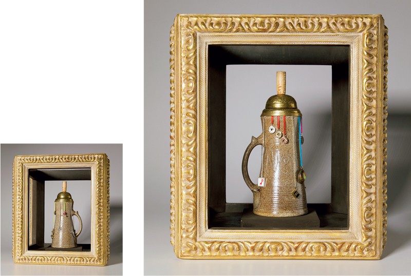
It helps to have been given a specific individual pot, namely a gorgeous salt-glazed John Dwight tankard from the seveneenth-century Fulham Pottery, in London (fig. 21). From there I began weaving an aesthetic narrative that is, essentially, a morality tale.
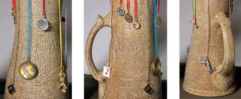
I made a tall mug, banded it like Dwight’s, added my version of a North Devon handle and a Cardewian thumb-stop, and wrote “NO” on one side, and “MORE” on the other (figs. 22, 23). The font is Times New Graffiti.
Which way do we go? None or some? Some or more? More or too much? What happens if you say NO to alcohol, and what happens if you say MORE? Who tells you to say NO, and who tells you to say MORE?
Illustrating the dueling themes of NO and MORE, I suspended related amulets from the rim of the mug, using chains and colored thread to dangle the charms and divide the space.
On the NO side is a pendant from Mothers Against Drunk Driving (MADD) representing all those who have lost loved ones to alcohol-induced road accidents. Next, signifying sexual inhibition is the slogan of the conservative sexual abstinence movement, “TRUE LOVE WAITS.” Abstinence, as a component of sex education, however, has been shown to lead to more unwanted pregnancies, not fewer. Then a Bible charm, symbolizing its many references to alcohol, among them the miracle of turning water into wine (not the other way around), and of course the wine of the sacrament representing the blood of Christ. But religious pieties often advise against earthly pleasures.
Between the words “NO” and “MORE” are two charms, one a hippie peace sign with illustrations of the sun and the earth and all sweet things, embracing both yes and no. The other is from the gospel of Matthew, chapter 19, verse 26, which says, “With God all things are possible,” suggesting that God would also say NO and MORE.
Moving from duality to MORE, the first pendant is a Thai amulet of a naked woman lying on a penis. Alcohol has been known to lubricate sexuality. Next is the acronym BFF—BEST FRIENDS FOREVER—for the good times we have with friends and family when drinking. A colorful cocktail glass alludes to the colorful characters who inhabit bars and pubs, and, finally, as a cautionary coda, a gun to illustrate the violence that can erupt after the consumption of alcohol.
I could have added many more charms. The list of pros and cons is endless.
The domed lid of the mug echoes an ornate German beer stein but is actually a modified desk bell. The finial was removed and replaced with a wine bottle cork.
That’s the story of the pot, but the entire piece is placed within a three-dimensional, ornate, gilded, picture frame.
Why the frame? Pots are rarely the subject of paintings; usually they are mere stage props. Pots are objects, not subjects. To illustrate this are three paintings by Breughel that refer, incidentally, to the consumption of alcohol, and all have lovely pots in them.
As a potter, however, pots are central to my life, not peripheral, and I wanted this particular pot to be made special, to have its uniqueness predominate, to focus the viewer’s attention on it. So I did what is done to paintings: I put a frame around it.
It is a 3D portrait, framing not only an argument but also, more importantly, a pot.
To conclude:
Many years ago I read one of William Safire’s pieces on language in the New York Times Magazine, and when researching this project my murky memory led me back to this “relativist fallacy,” copied from Wikipedia (https://en.wikipedia.org/wiki/If-by-whiskey): “The label if-by-whiskey refers to a 1952 speech by Noah S. ‘Soggy’ Sweat, Jr., a young lawmaker from the U.S. state of Mississippi, on the subject of whether Mississippi should continue to prohibit (which it did until 1966) or finally legalize alcoholic beverages”:
My friends, I had not intended to discuss this controversial subject at this particular time. However, I want you to know that I do not shun controversy. On the contrary, I will take a stand on any issue at any time, regardless of how fraught with controversy it might be. You have asked me how I feel about whiskey. All right, here is how I feel about whiskey:
If when you say whiskey you mean the devil’s brew, the poison scourge, the bloody monster, that defiles innocence, dethrones reason, destroys the home, creates misery and poverty, yea, literally takes the bread from the mouths of little children; if you mean the evil drink that topples the Christian man and woman from the pinnacle of righteous, gracious living into the bottomless pit of degradation, and despair, and shame and helplessness, and hopelessness, then certainly I am against it.
But, if when you say whiskey you mean the oil of conversation, the philosophic wine, the ale that is consumed when good fellows get together, that puts a song in their hearts and laughter on their lips, and the warm glow of contentment in their eyes; if you mean Christmas cheer; if you mean the stimulating drink that puts the spring in the old gentleman’s step on a frosty, crispy morning; if you mean the drink which enables a man to magnify his joy, and his happiness, and to forget, if only for a -little while, life’s great tragedies, and heartaches, and sorrows; if you mean that drink, the sale of which pours into our treasuries untold millions of dollars, which are used to provide tender care for our little crippled children, our blind, our deaf, our dumb, our pitiful aged and infirm; to build highways and hospitals and schools, then certainly I am for it.
Born in Stoke-on-Trent, England, Mark is the son and grandson of directors of Spode, the fine china manufacturers. In 1983 Mark met his wife, Carol; they moved to Pittsboro, North Carolina, and set up their pottery, where he began making the distinctive functional pots for which he is known.
ROBERTO LUGO I was humbled to receive the invitation to exhibit in “The Last Drop.” I selected a delft mug as my muse (fig. 24). My process often uses the history of ceramics and its propensity to separate class due to porcelain’s high cost prior to the open sources of recipes.
In this delft cup I see a landscape scene, blue and white—this is what I see in an immediate reaction, but I often try to understand historical works from the perspective of a minority who grew up in an underprivileged community (fig. 25). When I see water I often see death, whereas most see water. I think it is because I refused to ever get in a body of water as a child because the image of dead bodies being dumped in a nearby neighborhood made me fear being close enough to water that it might also take me.
I enjoy juxtaposing pleasant images, like a landscape, with imagery from my heritage and culture.
Roberto Lugo is an American potter, social activist, spoken-word poet, and educator. He is an assistant professor at Tyler School of Art in Philadelphia, Pennsylvania.
SENORA LYNCH When I was asked to participate in this pottery exhibit, I said, Yes, of course. That sounds interesting. As an artist and a potter, it is always exciting when someone wants to exhibit your work in a gallery. It is exciting to know that your work will be seen and that you are able to have your work sit alongside that of other extraordinary potters. But when I heard that I had to write a 750-word essay to accompany my piece of art, I thought, I’m a potter, not a writer! I express myself through design, not writing. Yet at the same time I was wondering, in the back of my head, when it was due, hoping I had plenty of time. Sure, I will do it! Somehow the spirits help you BELIEVE.
As I began preparing for this piece to be made, I dove deeper into the purpose of the exhibit and started to explore the meaning behind its title, “The Last Drop: Intoxicating Pottery, Past and Present.” The title brought forth a mixture of thoughts and emotions that helped to fuel my design process. My mind began to fill up like a tall glass of wine. I thought of alcohol—its consumption, history, and purpose, as well as its effects in the past and present. All of these thoughts helped to bring forth my creation titled From the Earth, We Drink.
Here are just a few of the drops that filled my mind.
The Last Drop
Hey, man! What’s in the cup? Aren’t you sharing? Pass it around. What’s in there so good? Hey! Pass it around. Don’t wait ’til the last drop!
The last drop of what? The last drop of water, the last drop of land, the last drop of clay, the last story, last tradition, the last drop of medicine.
Hey! Don’t be greedy! Pass the cup!
The last drop of a sacred song, the last drop of a sacred birth, the last drop of tobacco, the last drop of cotton, the last dance, the last time with grandpa, the last laugh, the last of grandma’s biscuit.
Hey! Don’t be greedy! Pass the cup!
The last of the firewater, the last of the white lightning, the last drop of communion, the last drop of breath, the last teardrop.
Hey! Pass the cup!
As long as I pass the last drop . . .
“As you take the backwash of the last drop, all things will continue. The thirst will be quenched. All things are passed to the next generation.”—The Last of the Mohicans
Well then . . . don’t wait until the last drop! Don’t drink the last drop! Go ahead! Pass the cup!That Don’t Mix
American Indians, White Lightning, Wahoo . . . That don’t mix! . . . A lot of laughter though . . .Intoxicated
Intoxicated to the clay, to the smell of the earth, to the idea of creation.
Can’t stop. Can’t let go. Addicted.
Getting close to the last drop.
Gotta go back to get more.
You want to quit, but you can’t.
The Bottle Was Always With Them
This is the life of one person’s story I know.
Every man her mother married was an alcoholic.
Her grandfather drank for 66 years. He must have started when he was 10.
She was a great Mom. She fed them and fed them well.
Their whole house was full of laughter—clowns, fools, and those that cut a fool.
Actors, charades, mockery . . . beach trips. The bottle was always with them.
Going to church, the bottle was always with them.
This was their way of life. Everybody drank.
Now, some people just have a glass of wine . . . EVERY NIGHT.
Isn’t this the way to health?
Next, I had to make my piece for the exhibit. The piece of ceramic that I chose to use as an example was the mug from Staffordshire, England, dated 1742 (fig. 26). I selected it because it has a two-color contrast and is hand-etched. My personal style of pottery also has a two-color contrast and is hand-etched, so I felt most comfortable with this piece serving as my inspiration.
From the Earth, We Drink (fig. 27) is designed with many of the fruits from Mother Earth that our wines are made from, those that quench our thirst and bring us health: the locust tree, black cherries, strawberries, blackberries, grapes, as well as corn. It also has a crisscross pattern, which represents that life is plentiful and good. Similar to the designs on my other pottery, these were inspired by the history of my Haliwa-Saponi tribe, the stories from my family, and the environment around me.
Senora Lynch is a contemporary potter and a member of the Haliwa-Saponi tribe. She is a resident of Warren County, North Carolina, and is nationally known for her creation of exquisite Native American handmade pottery.
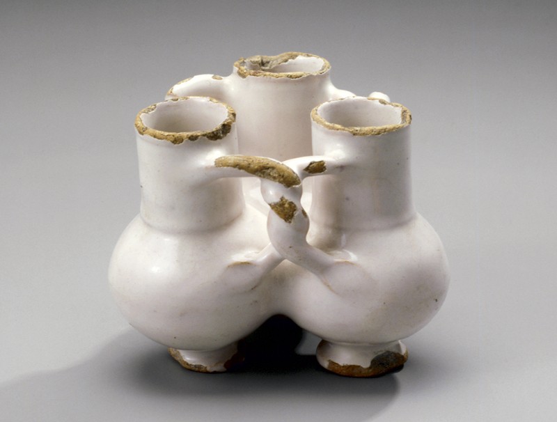
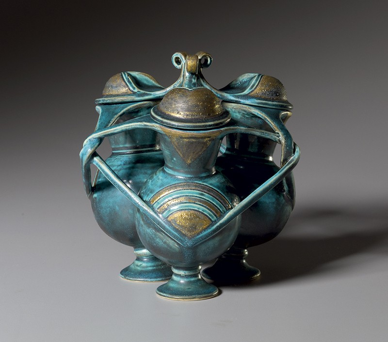
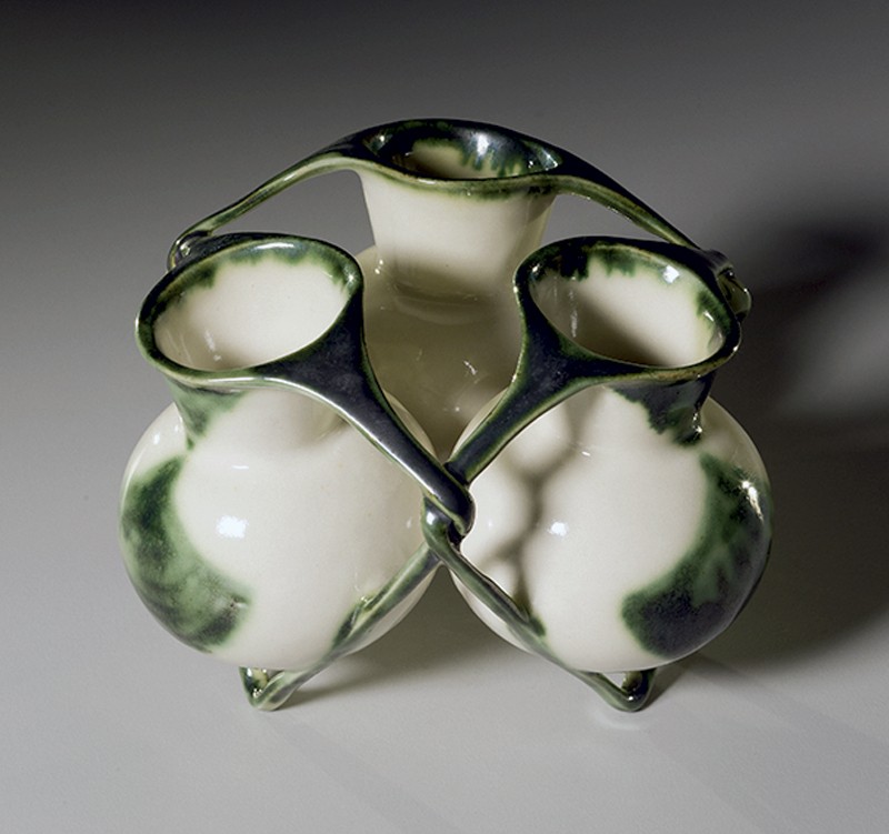
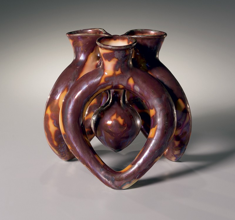
IBRAHIM SAID My reason for selecting the English delft fuddling cup (fig. 28) for this exhibition was twofold: it was the only vessel option offered that was meant to be shared between individuals; and I love geometry, and the shape of the three interconnected cups and their twisted handles formed a six-pointed star. My selection was made before reading any description of what it had been used for.
Eating food from shared plates and drinking from shared cups is how I grew up having meals in Egypt, not just with my family but with friends as well. Here in America, I miss that intimacy. The irony that this exhibition was based on vessels of intoxication and yet I don’t actually drink alcohol was not lost on me. However, I didn’t think it was reason enough to not participate in the show, because sharing, celebrating, and enjoying the company of friends and playing games are shared all over the world, and are not in any way exclusive to the drinking of liquor.
Since being invited to participate in “The Last Drop” I have made three pieces in response to this seventeenth-century fuddling cup: Triplet Cup with Finials (fig. 29), Triplet Cup (fig. 30), and Heart (fig. 31); each time I simplified the formal elements and expanded on the personal nature of the theme.
My work has always been rooted in expanding on forms and principles from my own culture, namely ancient Egyptian pottery and the use of geometry in Islamic art. With this show, I had the chance to expand my conversation to seventeenth-century British ceramics and consider what I might have in common with another culture and someone else’s history.
My first attempt takes the six-pointed star as the primary motif to be carried out more dominantly in as many ways as possible—on the lid, body, surface design, and glaze. Tilting my vessels slightly outward gave me more negative space between the necks and the arms, which made the overall form feel lighter and have more rhythmic movement and playfulness. The turquoise glaze and gold patina were an attempt to tie it back to an ancient Egyptian feeling.
In my second attempt, I wanted to lean toward the idea of sharing as ritual. I wanted to simplify and focus on the triangular movement of the intertwined arms and make the piece feel even lighter and more elegant. I shifted the angle of the arms more sharply downward from the neck to the body; the arms then become the actual legs of the piece so that they appear to frame and nestle the body within a larger three-dimensional star. It became a precious thing, an object to commune with and contemplate.
Then interconnectedness became the theme. The concepts of sharing and bonding, and the heart being the center of those connections, led to my last piece. If sharing is at the core of bonding, and bonding is what brings us closer together and builds trust and connections, I wanted to focus on that. I continued to strive to make the function of a freestanding vessel somehow build off of the rhythmic triangular movement of the handles, so I considered whether the handles and feet of the form could be one and the same, and whether there could be separate and shared vessels combined. Geometry underlies the simplicity of these decisions. Once the form was built, and the suspended vessel in the center of piece hovered in the center, like a heart, I knew it should be red. Red is connected to blood and blood to the body, and connections between bodies and not just minds. When we share a drink and break bread with others, we share something of ourselves in an attempt to be closer.
Ibrahim Said was born in 1976 in Fustate, Egypt, and comes from a family of potters. He now lives and works in both Greensboro, North Carolina, and Cairo, Egypt.
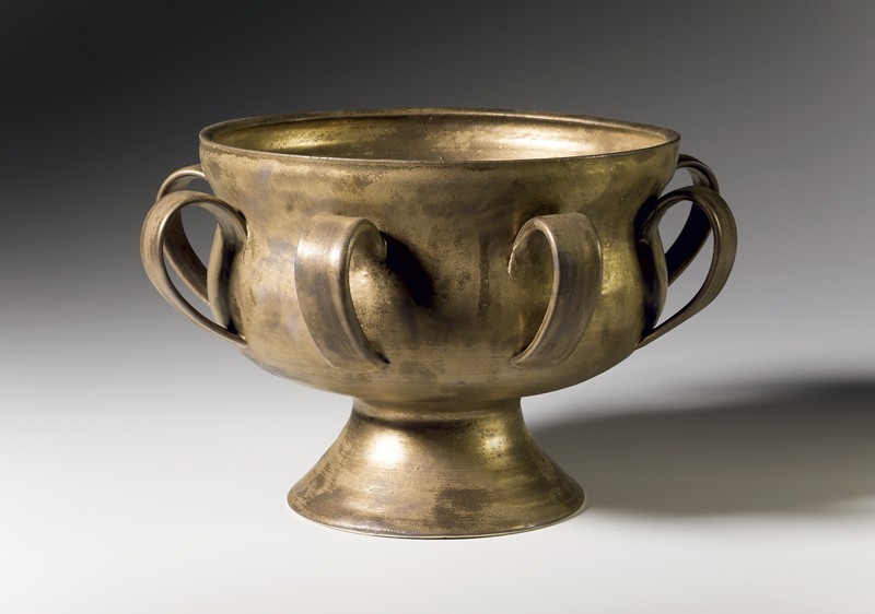
AKIRA SATAKE The inspiration for my assignment was a lead-glazed, two-handled cup made in England in the late 1600s that was used in a ceremonial fashion for the communal consumption of alcoholic beverages (fig. 32). The double handles signify that this was a cup to be shared with others in a rather ritualistic way, not to be used for solitary drinking. I started thinking about other drinking ceremonies and was reminded of the Japanese tea ceremony, which evolved during the Momoyama Period (1568–1615) into the form that is still practiced today. It is interesting to note that the British cup was made during roughly the same time period as Japan’s Momoyama era.
Although it did not involve alcoholic beverages, the tea ceremony nevertheless represented the sharing of a moment and a relationship, along with the sharing of a beverage. Often, a shogun would conduct a tea ceremony with his samurai before going to war, to instill a sense of calm and to give them, and himself, a chance to meditate and prepare for what lay ahead.
The shape of the British cup also reminded me of the Iga-style water jar (mizusashi) traditionally used in tea ceremonies. I decided to make my vessel from an Iga/Shigaraki-style clay I make with ingredients from several different areas of the U.S., including local North Carolina feldspar with silica and mica mixed in (fig. 33). The original cup was fired at a low temperature using a lead glaze; I fired mine in a wood-fired kiln without any glaze for fifty hours to an extremely high temperature of more than 2300°F, giving it a natural ash-glazed surface.
For me, the act of creation is a collaboration between myself, the clay, and the fire. Collaboration means finding what the clay wants to be and bringing out its beauty in the way that the beauty of our surroundings is created by natural forces. Undulations in the sand that has been moved by the wind, rock formations caused by landslides, the crackle and patina in the wall of an old house—all these owe their special beauty to the random hand of Nature. The fire is the ultimate random part of the collaborative equation. I hope the fire will be my ally, but I know it will always transform the clay in ways I cannot anticipate.
I like to imagine my cup being used by a group of samurai during the Momoyama Period before a battle, sharing sake to encourage each other, or afterward, to celebrate their victory and maybe to console themselves over the loss of some comrades.
Akira Satake was born in Osaka, Japan, and has been living in the U.S. since 1983. A noted musician as well as stoneware potter, he maintains a ceramics gallery in Asheville, North Carolina.
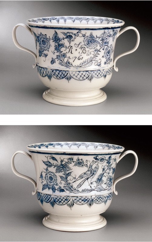
VIRGINIA SCOTCHIE The bowl I created for this exhibition was influenced by an eighteenth-century Staffordshire two-handle punch cup (fig. 34). I choose my historical pieces based on the form and handles on the punch bowl, and also the significance of this particular piece of pottery being the center of attention when everyone gathers to receive their drink!
My piece was wheel-thrown and assembled with the foot being thrown onto the bottom of the trimmed bowl to achieve the elegance of form and visual size I was looking for in this piece (fig. 35). All of the handles were pulled and then attached to the bowl. I made many handles so that one could always find a way to pick up this piece of pottery if feeling a bit tipsy at the end of the party!
The bronze glaze was brushed on the bisque ware and fired to 2000°F in an oxidation atmosphere. It is food safe, and of course the glaze is often mistaken for a real bronze material—one of the many things ceramics is so adaptable to, fooling the eye.
Great to make this piece . . . would have never thought of this form if Rob Hunter had not tossed it my way!
Virginia Scotchie is a ceramic artist and area head of ceramics at the University of South Carolina in Columbia. Virginia exhibits her work extensively throughout the United States and abroad.
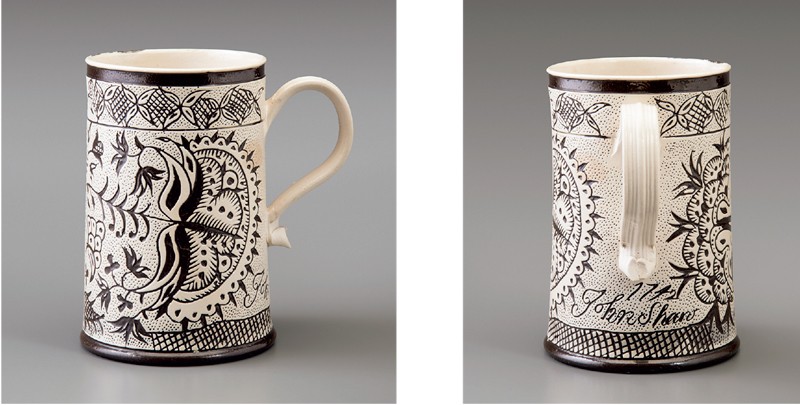
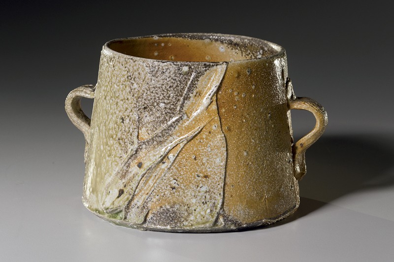
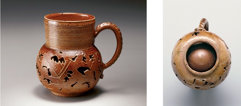
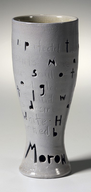
MARK SHAPIRO I first saw a Morley pierced double-walled stoneware mug in the Delhom Collection at the Mint Museum in Charlotte, North Carolina, almost three decades ago. It struck me then and has stuck with me ever since. First, I love this basic cup form: a cylinder atop a globe, wedded with a handle. I’ve seen variations of this iconic form in pre-modern European, Native American, and Islamic ceramics, but there is an extravagance to the pierced double-walled version. The visual and technical complexity of this usually humble pot is undeniable. For a potter to throw two independent and joined walls is a lot of extra work, yet offers less volume for the drinker. So why the double wall? The handle takes care of any concern that a hot beverage could transfer heat from the inner wall and make the pot uncomfortable and necessitate the second skin. But there is something immensely pleasing about the way the inner container hangs down from the rim of the outer form, suspended but not touching the foot ring. And the double wall makes possible the strangely stylized foliate piercings, a visual play on our expectation of a container’s integrity: this mug has holes and yet is not leaky. The iconography of the Delhom mug’s time-consuming piercings is quirky, somewhere between star and fossil, the curvilinear incised stems mannered.
My appetite whetted by my earlier encounter with one of the mug’s cousins, I embraced the chance to respond to the Chipstone collection’s Morley mug (fig. 36). To my eye, this mug has an even more pleasing shape and proportion. The straighter neck makes the belly feel more globular, which in turn is echoed in the rounded arc of its handle. The piercings, while still perhaps vegetal, are even stranger, reading as abstracted landmasses or maybe bats. Where the Delhom mug’s piercings repeat a couple of motifs, the Chipstone mug’s are free and wild, almost doodles, each pierced shape a mark of the potter’s boundless imagination. The incised straight stem lines are also more abstracted and unselfconscious. What a pot!
First, to get to know the historical object I threw a facsimile of the Morley mug in dark stoneware. A neighbor was taken by it and carried it off to decorate with piercings of his own devising. Then I made a pilsner form in a porcelaneous white stoneware, which I felt had a relation to the fine fabric of the Nottingham mug, but with a brighter graphic quality that I thought would work well in my salt-and-wood kiln. The taller pilsner seemed more contemporary. I decorated the first one with piercings after the Chipstone mug, to get their feel, then I made some taller double-walled pilsners, which stood on a ware shelf waiting to be pierced.
I had seen Nottingham pots with inscriptions, and in my studio practice I sometimes write text on my pots that encapsulates cultural or historical moments. So I moved toward that idea for this piece, waiting for the right words to arrive and grab me, and thinking about how to render them.
Around that time, it was reported that Secretary of State Rex Tillerson called President Trump a “f—ing moron” after Trump reportedly had astonished his military brass by saying he wanted to retool the nation’s nuclear stockpile up to its peak level of half a century ago—a tenfold increase that would break the international agreements the U.S. has stuck to since the 1980s. In that situation-room meeting, he also showed shockingly little understanding of Afghanistan and North Korea. That moment brought home just how weird things had become: the CEO of the biggest fossil-fuel corporation in the world becomes secretary of state, with no previous diplomatic or political experience, and finds our nation’s president to be grossly uninformed and incompetent, and is incensed enough to let it slip. Wow.
An H. L. Mencken quote from a 1920 Baltimore Evening Sun article had started circulating again after the 2016 election. It seemed uncannily prophetic then, but we didn’t know at that time that the muckraking newspaperman’s concluding word would be exactly the one Tillerson, in uncensored frustration, called his boss:
As democracy is perfected, the office of president represents, more and more closely, the inner soul of the people. On some great and glorious day, the plain folks of the land will reach their heart’s desire at last and the White House will be adorned by a downright moron.
Laying out the text and cutting the letters was laborious. I’ve never been much for penmanship, but I let that go and went at the clay with an X-ACTO knife for the first letters of each word (along with a drill to get the round letters started), and scrawled in the rest of the text. Piercing just the first letters gave a random overall feeling.
Taking this cup out of the kiln, I was pleased by its amber interior against the salted orange-peel textured gray of its exterior (fig. 37). I hope my pilsner will be interesting to drink from. Texts that revolve around a pot invite the user to rotate it, contemplating, slowly rendering the words comprehensible. As Mencken’s prophecy moves around your field of vision, from the table to your hand, and up your mouth to take that first sip, I’d imagine you might well need that drink . . . and perhaps another.
Mark Shapiro moved from New York City to rural western Massachusetts in 1986 to build a wood kiln and make pots. He continues to live and work at his Massachusetts studio, where he produces about one hundred pots a week.
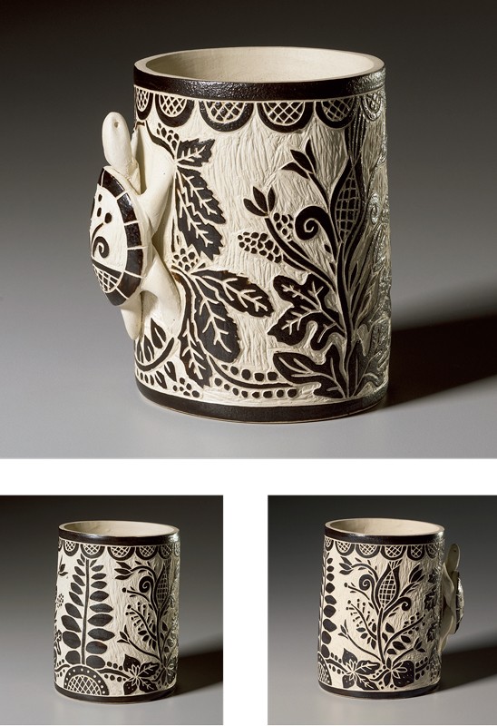
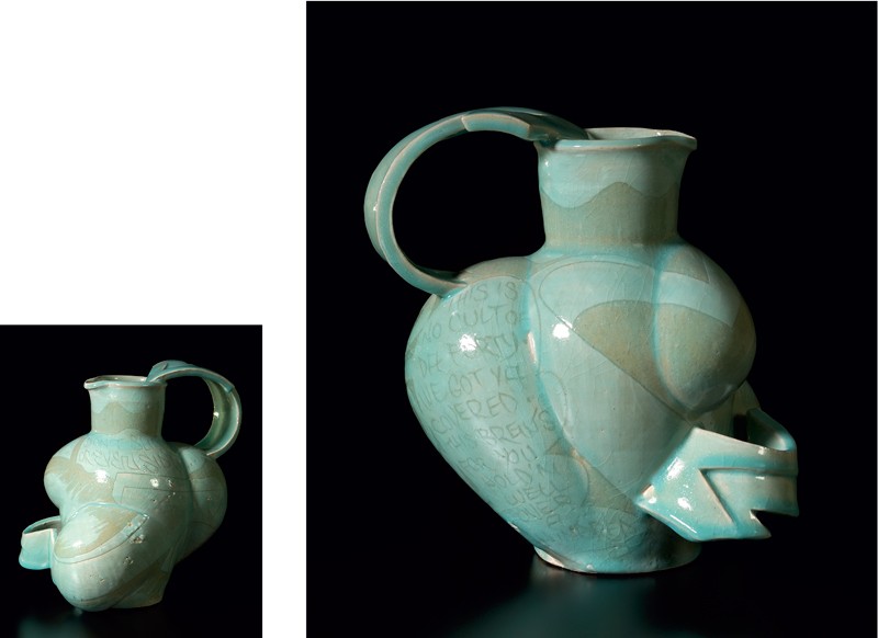
MALCOLM MOBUTU SMITH The fecund bounty suggested by the collective group of English harvest jugs struck me as exciting, right and ready for interpretation (fig. 38). Equally primed for examination are the cut slip images parading around the expanse of the rotund shapes with a skillful nonchalance—rehearsed forms, stylized conventions of shapes, symbols, and compositions. The compositions on these bodies are confined by the demands to circumnavigate the orb of the vessel. A pulse of images moving from mark to shape, from positive to negative forms, from image sign to text, all with a gentle but persistent sense of horror vacui. These conventions and cramped spaces of design held within a frame, the frame of the vessel itself, the compositional space of the pot constrained by the terminus of foot and lip, by subdivisions of registration, the directional change from shoulder to neck and neck to lip, all called to mind for me the same forces on compositional / inventive spaces appended and utilized in the production of graffiti wall murals, burners, or train pieces, bombs. These locations of graf where the structure of the painted design is held in check by both the limits of the object itself—the expanse of a given wall or the fixed dimension of a train car—and even more specifically governed by internal mechanisms of architecture or train car features such as the space below the windows or the architectural confines of door jambs, windows, and horizontal or vertical design motifs on a wall. These limitations create a space for the generated images to dance within and between in constant conversation and tension with the fabric of the form it resides on. It is this connection of cut slip, sgraffito decorations, on the harvest vessels and the landscape of graffiti imagery that I used as my bridge between then and now in my explorations of the harvest jug of North Devon from 1748.
I advanced into the territory of these jugs first with sincerity and studied making—seeking to practice the forms literally, to understand the vessels’ breadth. I reviewed dozens of the examples, visually noting the variations and recurrences of the pots’ form in stature and relative liveliness. These signs of manufacture that give each pot its identity and forensic code of human presence and authority reveal the humanity of the making. By way of cagey extension and consistent with my strategy to merge graffiti imagery through the sgraffito conventions of the original harvest jugs is the braggadocio of the messages conveyed in both systems’ picture making.
The harvest jugs happily advertising the unrestrained need and desire to partake of the libations held within while extolling the virtues of drinking. In a similar manner, the main purpose of graffiti and hip-hop is to shout its name and presence to the world, proclaiming each instance to be the best example to date. Each tag and piece is a proud proclamation of necessity, virtuosity, and pride. Both types of imagery trend toward the bold and hyper flat. I worked directly with the sgraffito method but jazzed up the forms and dance between positive and negative.
My iconography pulled from the now of graffiti the conventions of arrows, cloud, and jagged movement (fig. 39). I sought to create vessels that honor the originals in fecund reality by bulging with improvised exaggerations “bent” like letters under the direction of the graf writer. The parallels continued as I found verse on the jugs and the verse through rap music to be well matched. One of the aspects of the original vessel’s design is the inscribed verse extolling the virtues of drink. I sought contemporary parallels with my hip hop vector mapping the verse into the work from rap culture’s braggadocio. So in place of the existing rhyme scheme, I have created my own rap lyrics praising drink and its abundance. I resisted sourcing lyrics from existing music, but as a practitioner in both worlds, hip-hop and clay, I felt some authority in drafting my own. Like the motto inscription below the coat of arms—“DI[struck-through]VET MON DRO I[struck-through]ETI,” or Divet mon droieti “God and my right” [Fr. Dieu et mon droit]—rap music’s voice assumes a position of authority as it touts its position wherein I have inscribed the words “Don’t Slip Up or Even Sip Up” as a command of sorts, followed by the reverse side’s inscription floating within a cloud element:
This is no cult of the forty [as in 40-oz. beers]
We got ya covered
This brew’s for you
Hold’n well over a
hundred
The original inscription surrounding the royal arms states: “Honi soit qui mal y pense,” meaning “Shame on whosoever would think badly of it,” meaning drink and drink up proudly. Ultimately my work is a reflection of the conversation I was having between the methods, the images, and my own playful sense of improvisations in form as filtered through my hip-hop roots.
Malcolm Mobutu Smith is an associate professor of ceramic art at Indiana University in Bloomington. Smith’s clay work is inspired by intersections of graffiti art, the graphic structure of comic books, and playful organic abstraction, a manifestation of his passion for jazz.
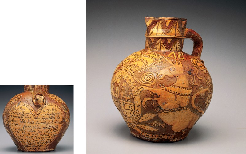
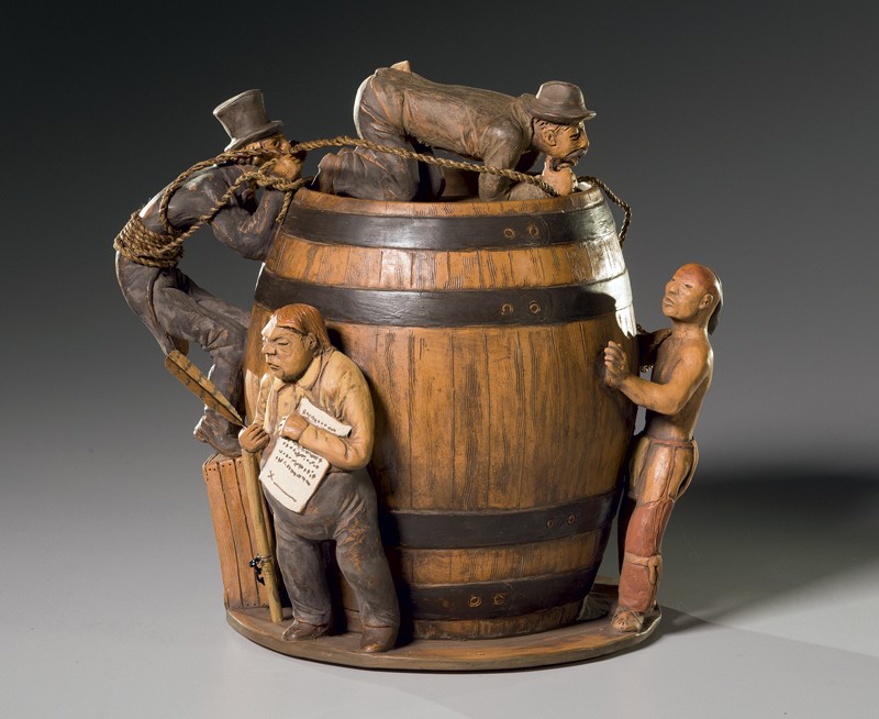
RICHARD ZANE SMITH My Wyandot family and ancestors have a sad and destructive history with alcohol. For the Last Drop project with Chipstone, I chose the eighteenth-century bear-baiting jug, made in Staffordshire, England, to inspire me (fig. 40). My own piece became an expression about what the use of alcohol meant to our indigenous people in the 1700s, especially in the Ohio homelands of which we have many written accounts, some of which are tragic, some embarrassing, and echo problems that continue to plague our people.
As a tribal member of the Wyandot Nation of Kansas, I’m involved in language revitalization, ceremony revival, and cultural arts recovery, so naturally artwork that’s grounded in ancient tradition inspires me. The most successful art, it seems, has one foot planted in ancient roots and the other reaching boldly into the present. I’ve been working as a full-time ceramic artist since the early 1980s, hand-building using ancient and ancestral techniques of the indigenous peoples of this continent. Social commentary is generally not something I do unless an idea keeps pestering me. The ideals expressed for this show intrigued me.
The notion of “bear baiting” seemed like a good place to start. From the old European sport of capturing a bear and keeping it chained to use as bait for attack dogs, forcing it to fight for its life in terror for the pleasure of its captors, the idea for my own vessel jelled. Trapping and capturing an “Indian” in intoxication, converting him to a foreign-based religion of submission, getting him to sign away his lands, and having Uncle Sam ready to make use of him as a pawn in an ever-growing army of conquest and he’s reduced to a U.S. soldier, a sports mascot, or even an Indian artist fighting other Indian artists for blue ribbons, a kind of upgraded arena sport for the wealthy class—and so the vessel Bear-Baiting an Indian came to be.
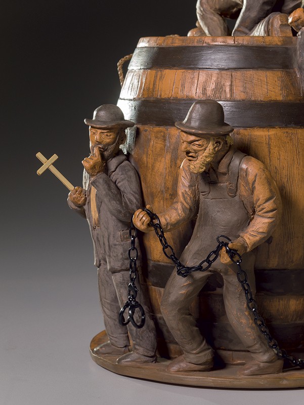
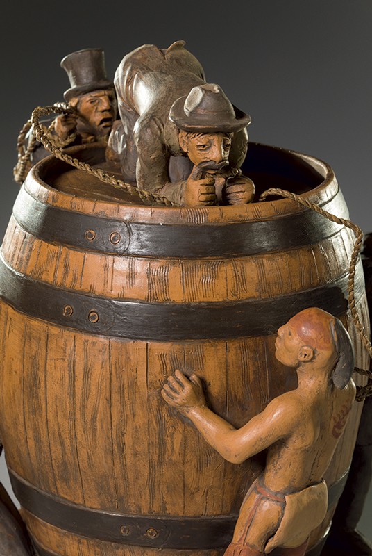
The first image that came to mind was the barrel or the keg in which whiskey was brought to our communities. Wyandot and many of the nations that surrounded us had no history with alcohol. There were no warnings or alerts even from our elders, who had no understanding of it. When men began to drink, they fought each other; and, taking it home, domestic violence came out of nowhere. A matriarchal society that valued women was trampled by inebriated young men whose emotions, once held in check, flowed like water. Our societies and cultural ways began to crumble.
Dressed in 1700s attire, a young Wyandot is reaching his full arm into the hole in the keg, scooping any liquor he can reach with a traditional wood spoon (fig. 41). Waiting at the keg just out of sight is the circuit-rider preacher. Itinerant preachers who came to our Ohio villages noticed drunkenness and spoke against it. Women who suffered abuse at home were often the first converts. Men who converted swore off drink and recovered, often leading the way for many of our customs and ceremonies to be rejected and discarded along with the demon alcohol.
Behind the preacher is an angry landowner tired of “Indians.” He’s bringing up the chain and shackles (fig. 42). He just wants Indians eradicated. On the other side of the vessel is the trader/banker, pen ready to have the drunken Indian sign away allotment lands. This was a common practice after Wyandot were relocated to Kansas. Our people did not understand debt. What they thought were gifts of a generous shopkeeper were often bills stacking up for unpaid goods. Eventually, lands were sold to pay off their debts and families lost everything.
The man with the rope on top of the vessel is a guide for European-American immigrants who took the Santa Fe Trail (fig. 43). He’s a horse thief. We have documents that show many who took the trails out west would frequently steal horses and cattle from the Wyandot people who had been removed to Kansas.
Uncle Sam (the vessel’s handle) represents all attempts to deal with “the Indian problem,” whether it was by the forced assimilation techniques used by boarding schools, recruitment into the armed forces, or doling out flour and lard as food rations. The clay was dug here in Oklahoma. I wanted the entire piece to have an old rusty cast-iron look.
Richard Zane Smith is a leading contemporary Native American potter of Wyandot heritage. He lives and works in Wyandotte, Oklahoma. His distinctive work is inspired by native clays, Pueblo pottery, and Wyandot basketry.