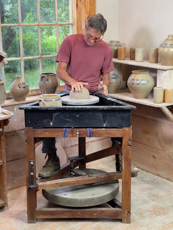
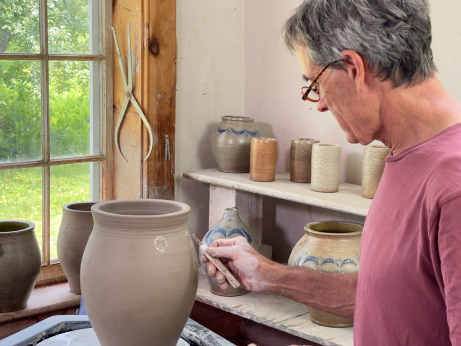
I HAVE BEEN MAKING wood-fired and salt-glazed stoneware pottery for nearly four decades (fig. 1). The rich and varied textures of these pots are born of a chemical union of clay and glaze. Sodium vapor is liberated at peak temperature, melding with the free silica in the clay to form a hard, orange-peel-like glass over the surface of a pot. The flame’s path pulls the sodium (and wood ash) around and through the kiln, depositing a varied gloss across the skin of the wares. Just as the potter’s hands mark the pot, its surface is marked in its journey through the firing. This compelling alchemy connects the beholder to the palpable presence of maker, material, and process.
Salt glazing developed over centuries, from its German discovery in the fourteenth century, through its many variations there, its adoption in England, and its migration to North America.[1] Brought from the Rhineland to New York City in the 1720s by the Crolius and Remmey families, salt-glazed stoneware flourished in the city from the last quarter of the eighteenth century through the first third of the nineteenth, nourished both by the abundant clay beds in nearby New Jersey and by the rapidly expanding post-Revolutionary population and economy. The excellence of the city’s stoneware was recognized in its day—it was the standard by which competing makers compared their wares. From the time when public institutions first collected early stoneware, New York’s potters were given pride of place.
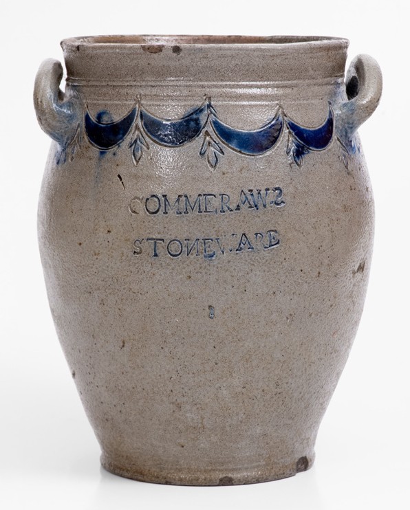
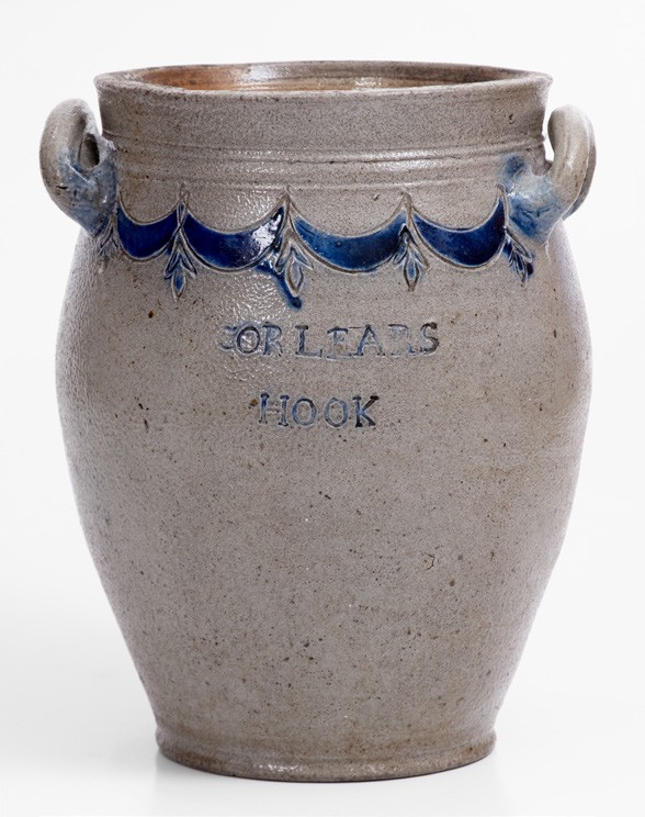
I have been inspired by these wares since I built my kiln in 1988, visiting museums and absorbing the books available at the time.[2] The John P. Remensnyder collection, mostly acquired by the Smithsonian Museum of American History, seemed to include many of the best examples, so in 2018 I applied for and received a Smithsonian Artist Residency Fellowship to study their stoneware holdings, which are rarely on view. The collection includes some of the finest unmarked eighteenth-century incised wares as well as many later marked ones. The museum holds a dozen or so pots by the New York potter Thomas W. Commeraw (1771 or 1772–1823) made between about 1797 and 1819 and numerous examples made by his peers.
During my residency, I was astounded to learn of Brandt Zipp’s discovery that Commeraw was of African descent.[3] Prior references had universally assumed his white identity. Commeraw worked squarely in the European-derived New York stoneware style; his work bears a practically familial resemblance to that of his white European-descended contemporaries, such as David Morgan, the multi-generational Remmeys, and the Croliuses, the latter of whom had in fact enslaved and manumitted Commeraw’s family, and probably trained him. While awaiting publication of Zipp’s research, I decided to dig in to understand as much as I could about Commeraw myself.[4]
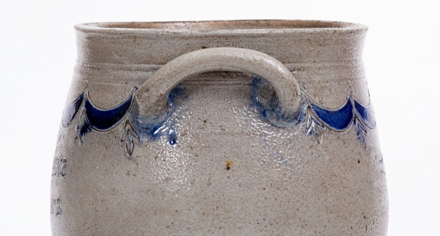
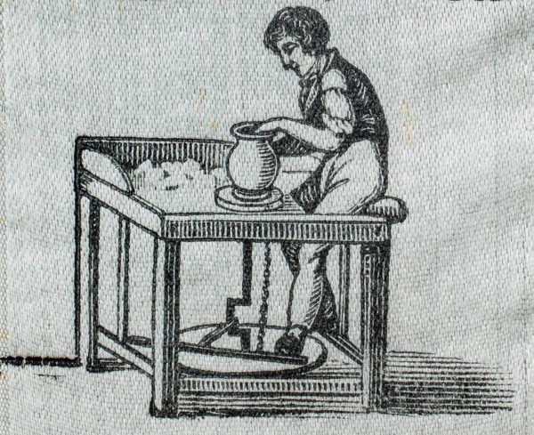
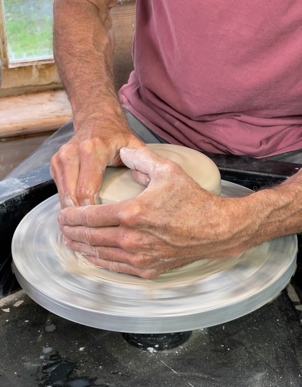
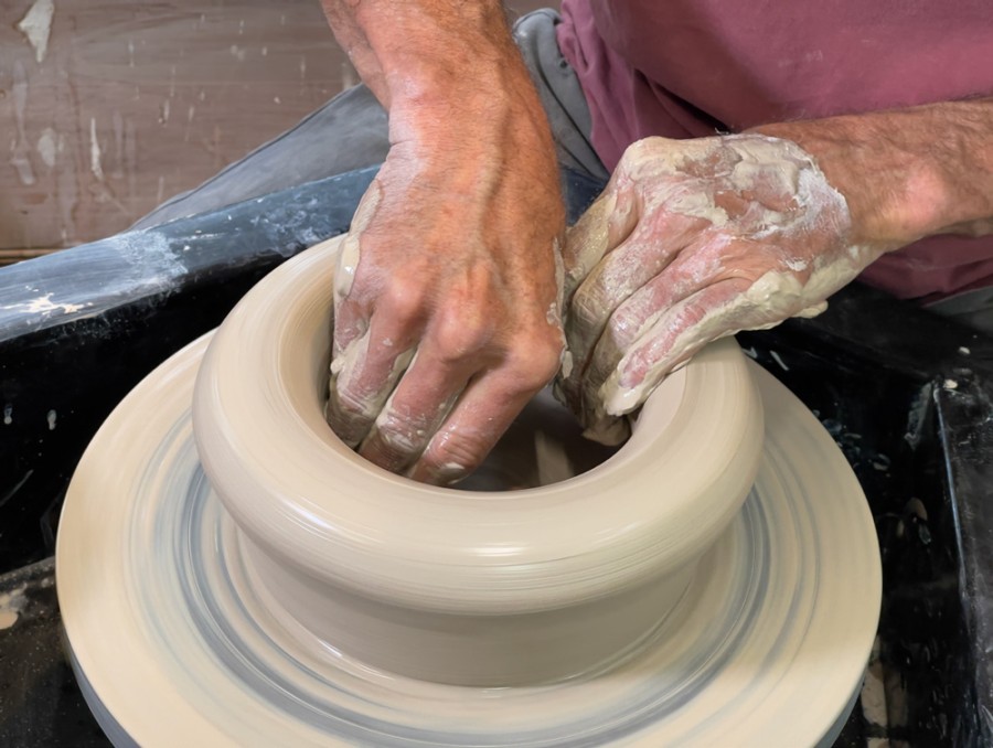
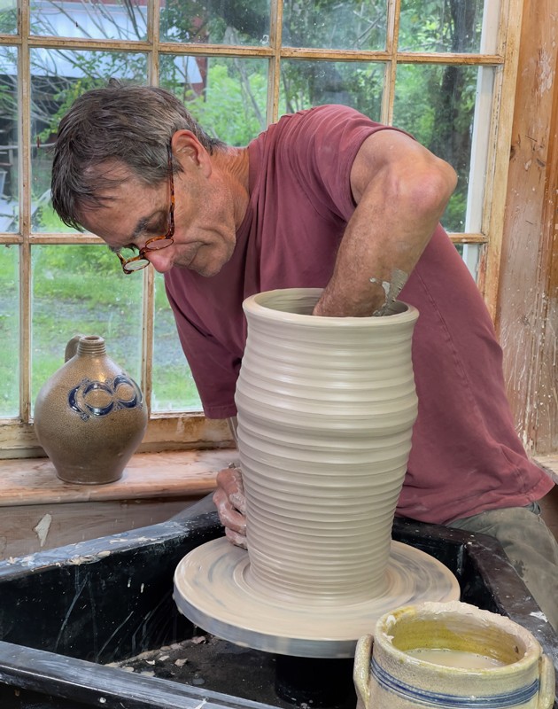
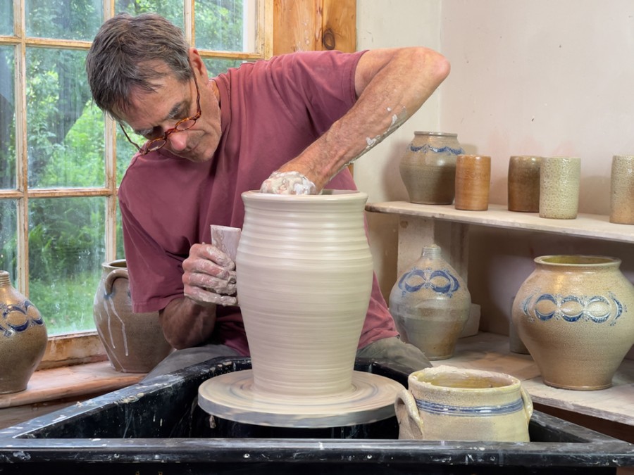
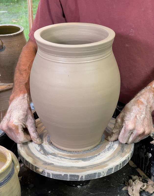
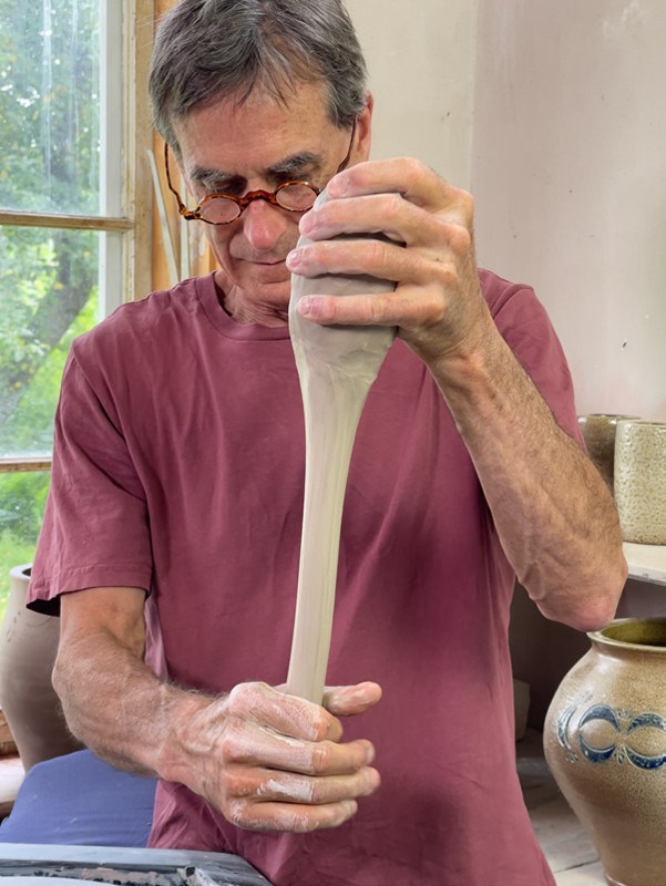
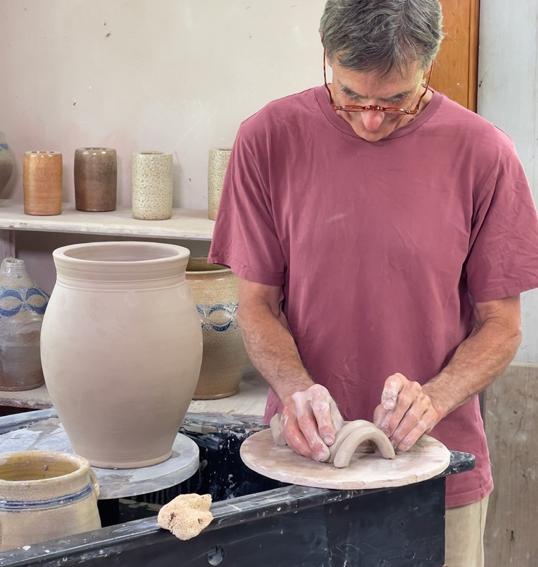
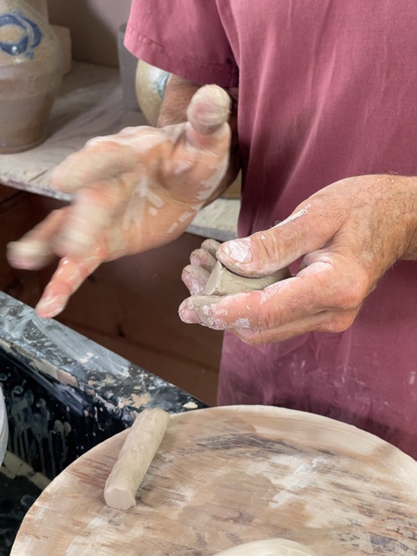
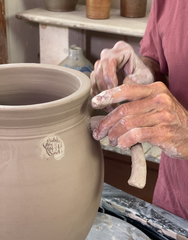
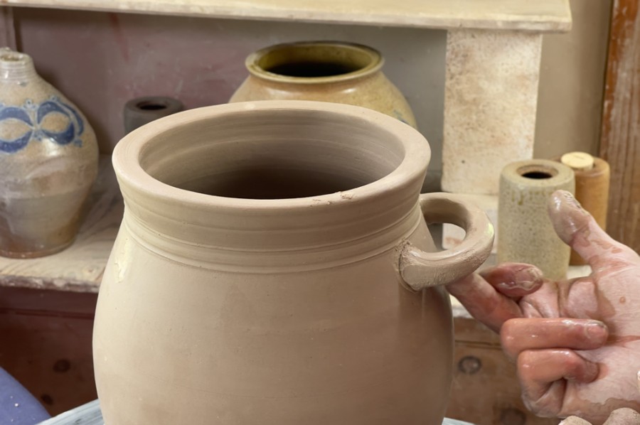
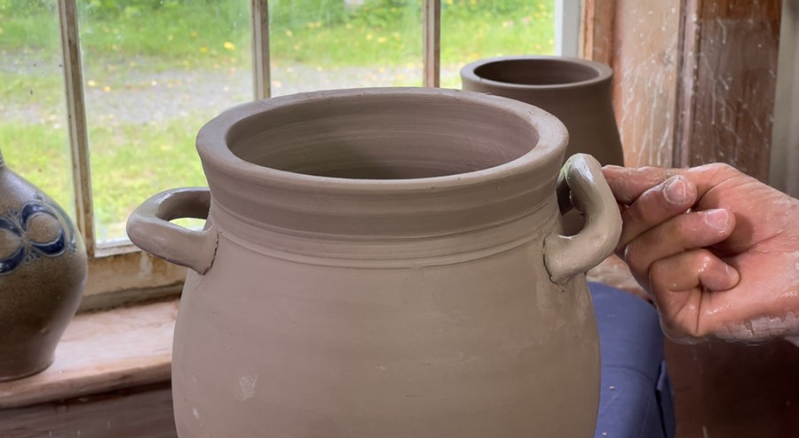
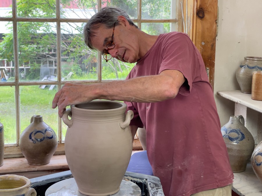
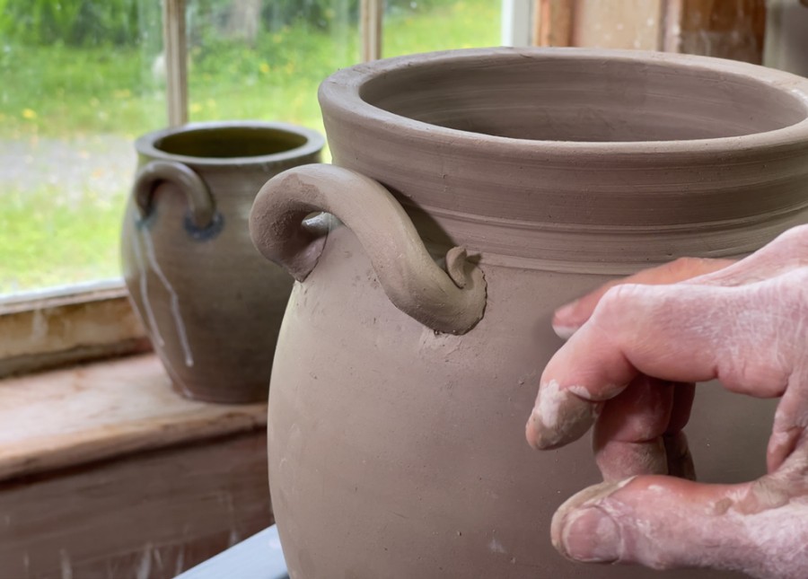
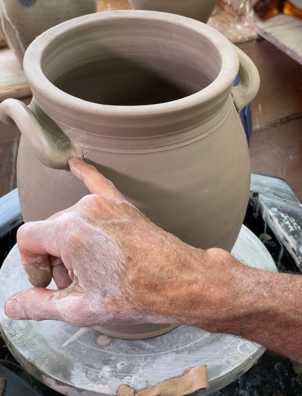
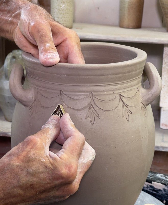
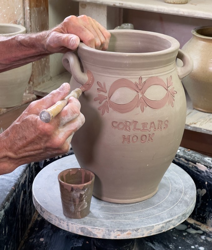
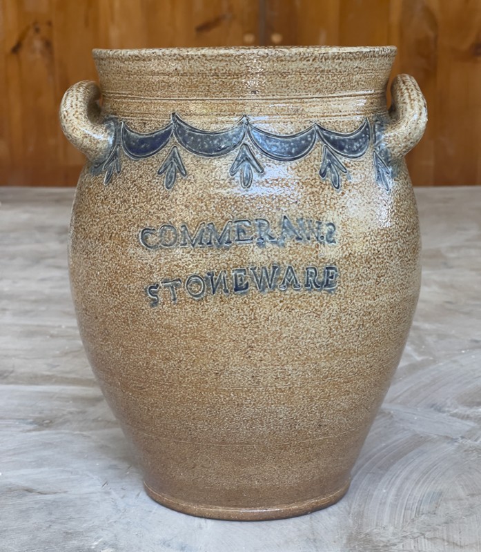
Beyond the excitement of learning about Commeraw’s remarkable life, I wanted to explore the specific techniques that Commeraw used to make his extraordinary pots. After dabbling at making Commeraw’s various forms—oyster jars, jugs, and jars—I chose to reproduce a classic jar with free-standing handles and Commeraw’s stylish stamped swag-and-tassel (figs. 2, 3, 4). To me, this jar is an exemplar of the highest-quality production ware coming out of Commeraw’s workshop. My reproduction was thrown on a foot-powered treadle wheel similar to one depicted on a nineteenthcentury New York Potter’s Society ribbon (fig. 5).[5] The jar form is an ovoid with a wide rim of particularly pleasing proportions, lovely and sturdy free-standing handles, and nice reeding at the foot and between the body and neck.
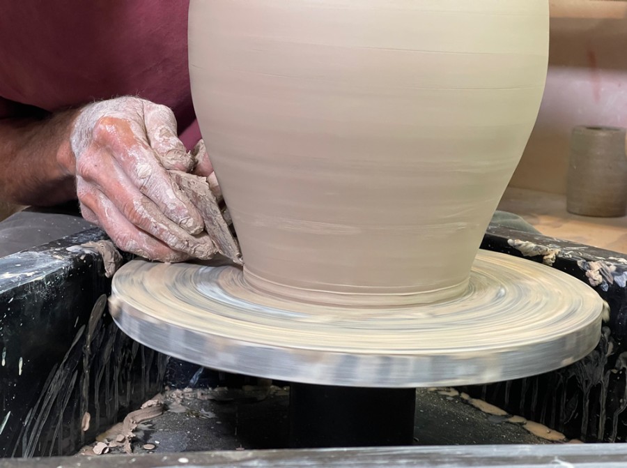
Making a swelling ovoid form like this was familiar to me given my long interest in early American pottery (figs. 6–23). But Commeraw’s surface decoration was another matter. How did he produce his iconic motifs? Why did he employ quirky stamped typography with inconsistent font sizes and a backward S and N—a seemingly anomalous choice given the evidence of his literacy in his writing and the flowing confidence of his signature on an extant document.[6] Commeraw would have known the proper orientation of these letters.
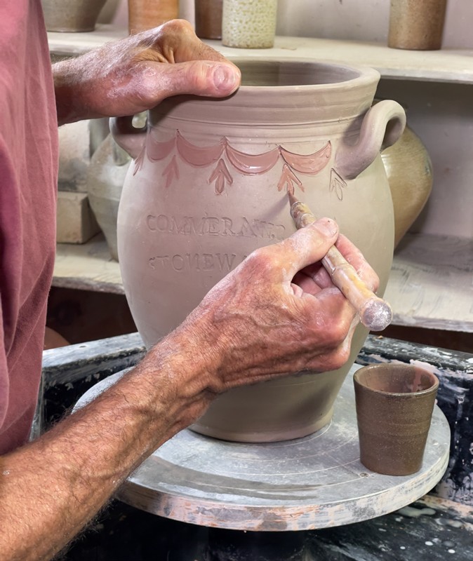
The swag-and-tassel motif, where he used it, would have been on both the front and reverse, wrapping the pot (figs. 1–2). I reproduced the motif on one side and instead made a bowknot figure (also called a clamshell) on the back using the same metal stamps (figs. 24–26). Commeraw generally put variations of these bowknots on jugs (narrow-necked, with a single handle on the back), but for some reason, not on his jars. But I wanted to demonstrate on one pot the flexibility of Commeraw’s stamping methods.
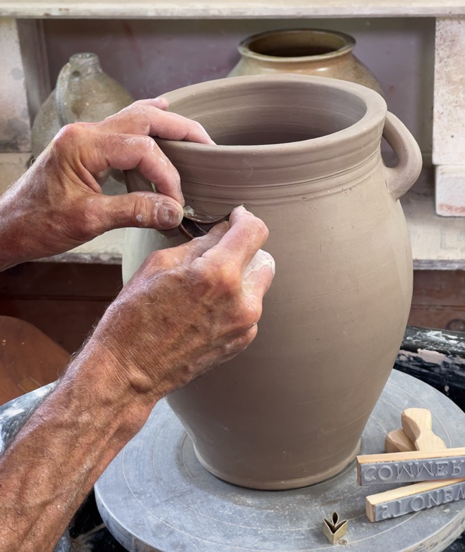
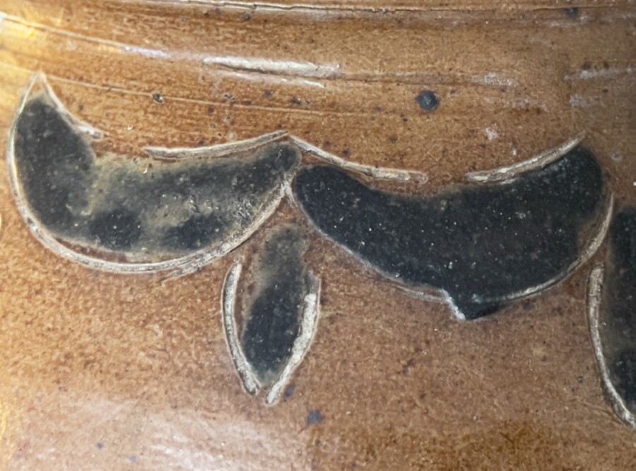
At first I was unclear as to whether Commeraw’s motifs—especially his swags (also called lunes)—were either stamped, or traced around or inside a template. The occasional doubled-up lines on some examples first led me to think that he used a stylus and that the template had shifted where the line was over-drawn. But the consistency of the marks of the lune figures (some pots show the stamp’s wear or flaws), as well as the quality of the line made by stamping, confirmed that this was indeed Commeraw’s method. The same wear or idiosyncrasy of certain stamps appears across multiple pots (fig. 27).[7] Additionally, the fussiness of tracing with one hand while holding a template with the other argued for a more efficient method. In fact, my experiments with the stamp showed that occasional double-struck and overlapping lines were indeed a byproduct of stamping. In applying the stamps, I saw that this was an extremely efficient means of rendering these designs onto clay surfaces.
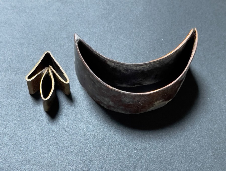
I fabricated the stamps from brass and copper stock that I had on hand, bending and soldering strips to form cookie-cutter-like components that can be repeatedly impressed into leather-hard clay using a variety of strategies (fig. 28). Linked or inverted, the same stamps can create swag-and-tassels or bowknots. Unlike Commeraw’s (and his peers’) earlier freehand incising, the stamps provided consistency and identity: a Commeraw pot’s stamped motifs make it instantly identifiable from across a room.[8] For almost two decades, he used the lune and tassel stamps to make the swag-and-tassel and bowknot motifs that built his brand. Emblazoning his wares with these bold logo-like emblems distinguished his wares from others.[9] These stamps also would have enabled others working in his shop over the years to consistently produce his decorations with minimal training and oversight.
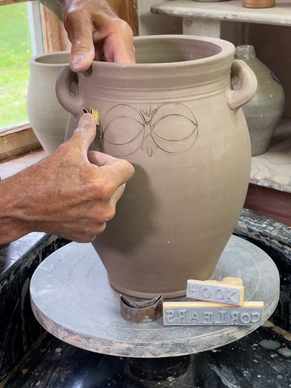
In addition to his recognizable motifs, his large and quirky typography let everyone know he was the pot’s maker. He used an emphatically possessive backward .S at the end of his name, unlike his competitors who simply stamped their name or name plus “MANUFACTURER” or “FACTORY,” et cetera. Here was a man who called attention to his personal role in production and his ownership of the workshop. Commeraw also made known the location of his shop to future buyers. This became common practice for potters during this period, and indeed, invoking New York added value to wares sold farther afield.
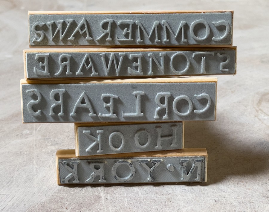
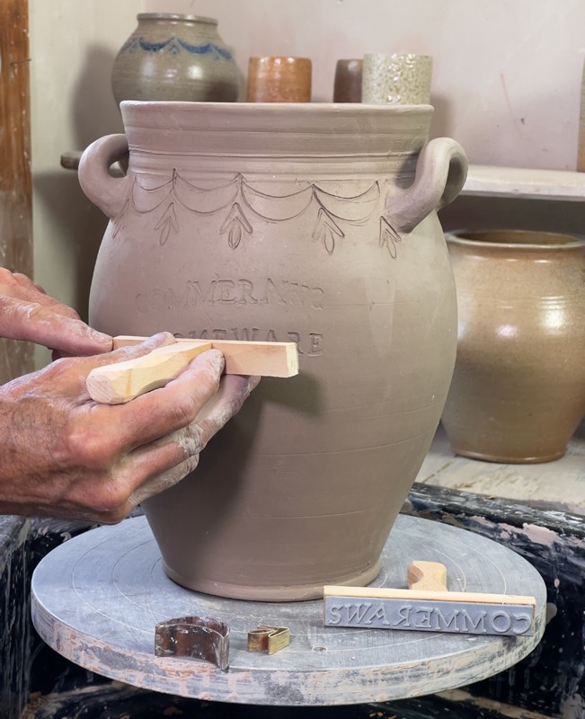
Commeraw’s typography appears to have been assembled from individual letters into five independent lines: COMMERAW.S, STONEWARE, CORLEARS, HOOK, and N.YORK, with each line of type clamped into a chase or holder. These could have been made from repurposed type, which would explain why the C in Commeraw (and in “CORLEARS”) is slightly tilted and of a smaller type size. Similarly, the S at the beginning of “STONEWARE” is smaller, and other letters within “CORLEARS” vary in size as well. But why, where, and how were the backward S in “COMMERAW.S” and the backward N in “STONEWARE” made?[10] Typographic letters, of course, are fabricated backward so when stuck, they read forwards. Simply rotating type 180 degrees does not render a backward letter; it just makes it upside down. Did Commeraw intentionally fabricate these backward letters by carving or casting them in correct orientation to grab attention as they were rendered on the pot backward? Was he purposefully jarring the norm?[11] I find the lines with the reversed letters strangely visually compelling. The backward possessive .S draws the eye, providing emphasis where Commeraw may very well have wanted it.
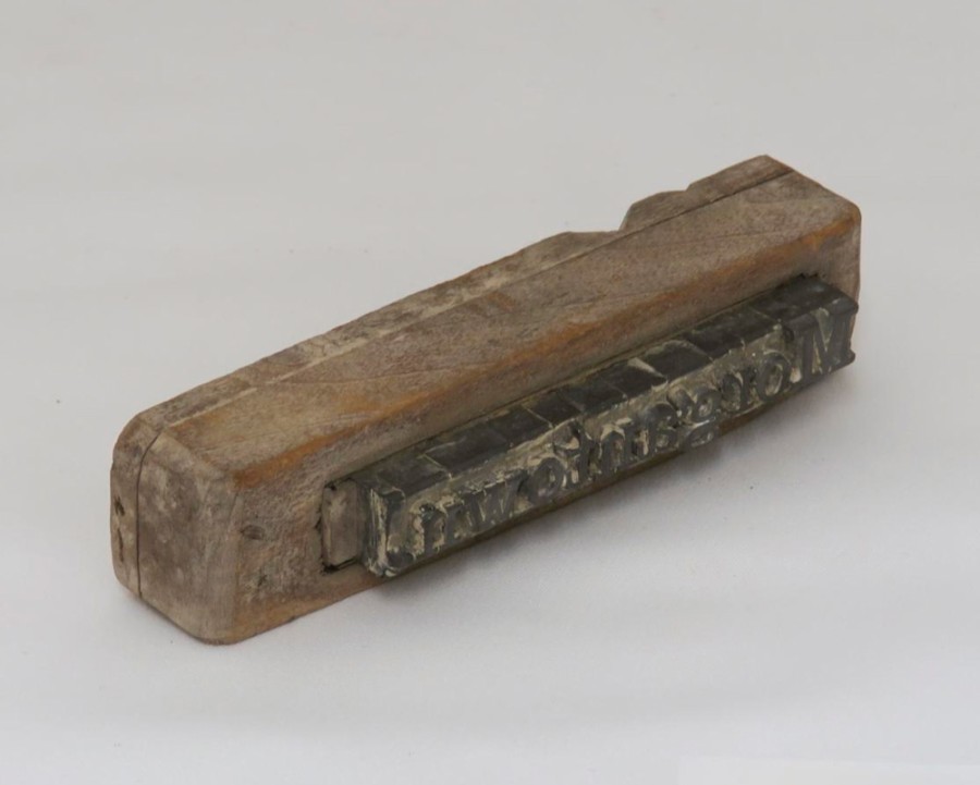
The lines of typography for this reproduction were made using images of text taken directly from Commeraw’s pots, producing 3-D files of them (thirteen percent larger to account for drying and firing shrinkage), and sending them out to be 3-D-printed on hard plastic strips—hardly period-appropriate, but expedient. I mounted them on wooden backings based on the Morgantown chase, added handles, and impressed them into the leather-hard clay (figs. 29–31).[12]
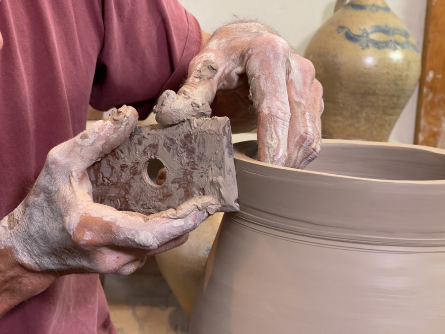
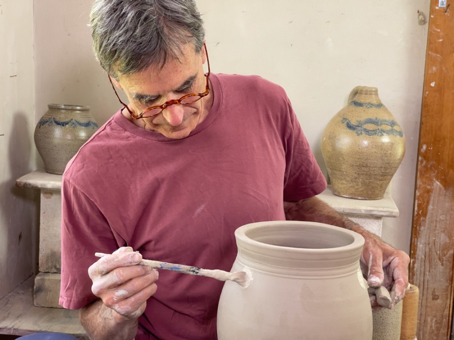
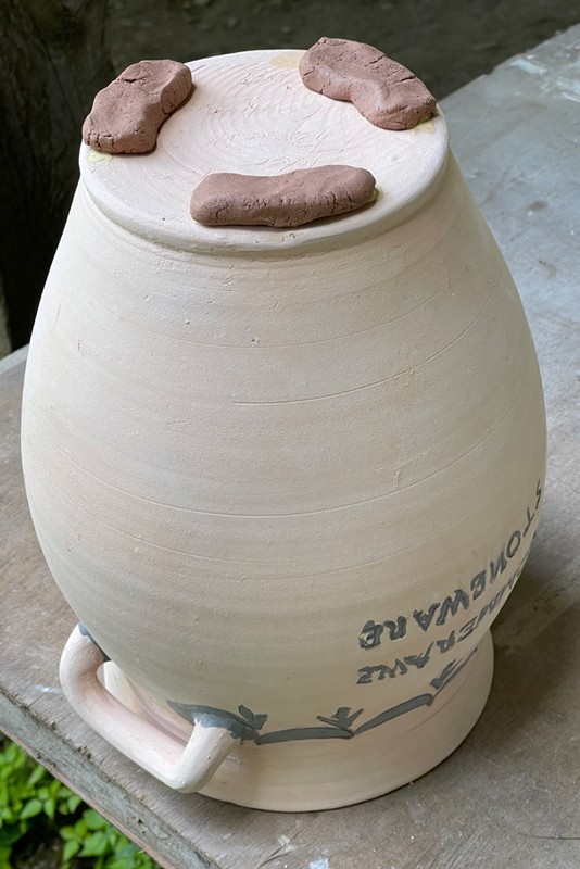
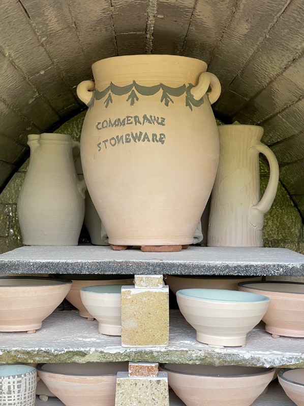
I filled the stamped motifs and letters and painted around the handle attachments with cobalt mixed with flux and some clay binder (figs. 32–33). To prevent the base from sticking in the kiln, the jar was wadded with a mixture of refractory clay and sand (fig. 34). I salt- and wood-fired the jar (figs. 35–36) but was not able to reproduce the original’s whitish clay body.[13] Certainly, my clay had too much iron content: Commeraw’s pot would have had a lighter, more kaolinitic body—or would have been fired in a more oxidized atmosphere.[14] Commeraw would have obtained his clay from the Morgan clay banks in New Jersey. Apparently Morgan clay was graded, as is suggested by a materials list from Nathaniel Clark in upstate New York from later in the century. Clark’s list refers to “Morgan’s Best,” which Clark mixed with twenty-five-percent Long Island clay (presumably of lower quality and likely iron-rich) as well as white sand.[15] The free-standing handle jar example would have been made using a light-burning clay readily available at the time, perhaps selected for a particular run of ware.[16]
Much can be learned from copying pots. Just as drawing is said to be a way of learning to see, the same can be said for the exercise of rendering in raw clay fired pots made by past (or present) masters. By reproducing proportions, surface quality, weight, transitions among parts, and so on, one gains intimate knowledge of the strategies and subtleties of another potter’s artistry. The process provides a window into the creative activity of another’s consciousness, outside the limitations of one’s own time and habits. Hardly anyone makes sturdy freestanding handles like these anymore, and it was magical to bend those horizontal loops upward to form that graceful curve rising toward the rim (figs. 20–21). Nor would a studio potter today broadly stamp his or her name across the face of a utilitarian jar, nor make one so sturdy. The reeding gives the jar a classical touch—something almost architectural from another time, though even in its own moment it was referencing an earlier time (figs. 10–11).
For me, making this pot was purely a heuristic and technical exercise, not to be confused with my own creative expression. While we are a social and mimetic species—human knowledge as embodied in objects is incremental and builds on the legacies of past makers—we participate in the human community most fully by making things that are for and of our own time and place. Thomas Commeraw made his outstanding pots within an idiom built on centuries of European stoneware potters filling and firing kilns and practiced by the New York City potters who trained him and with whom he competed—some of whose predecessors, even, had enslaved him and his family. His own works were both selfand culture-defining. His stylish and efficiently decorated wares were instantly identifiable as embodiments of his creative authority and identity as an independent master craftsman.